Monday, November 14, 2016

Mini-Makeover | Navy Blue In The Dining Room


I have always been smitten with navy blue furnishings - especially sideboards and dressers. I find myself pinning and saving screenshots of deep navy pieces all the time! So when it came time to decorate my own dining room I knew I had to go navy.

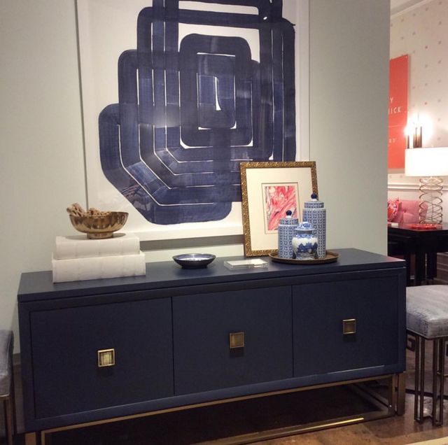
Now this next photo made my jaw hit the floor - this image saved from the always-inspiring Meredith Heron's IG account has been sitting on my phone for probably a couple of years. I knew I'd never be able to afford an amazing bespoke piece like this, but I was dreaming of it for some time:


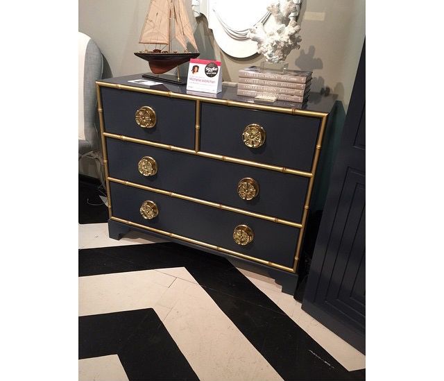
Have mercy! The gold & navy combo and that bamboo trim! I was in love. So I spent countless hours searching for "bamboo" in the furniture category on Craigslist. I eventually found this little veneer-covered diamond in the ruff:


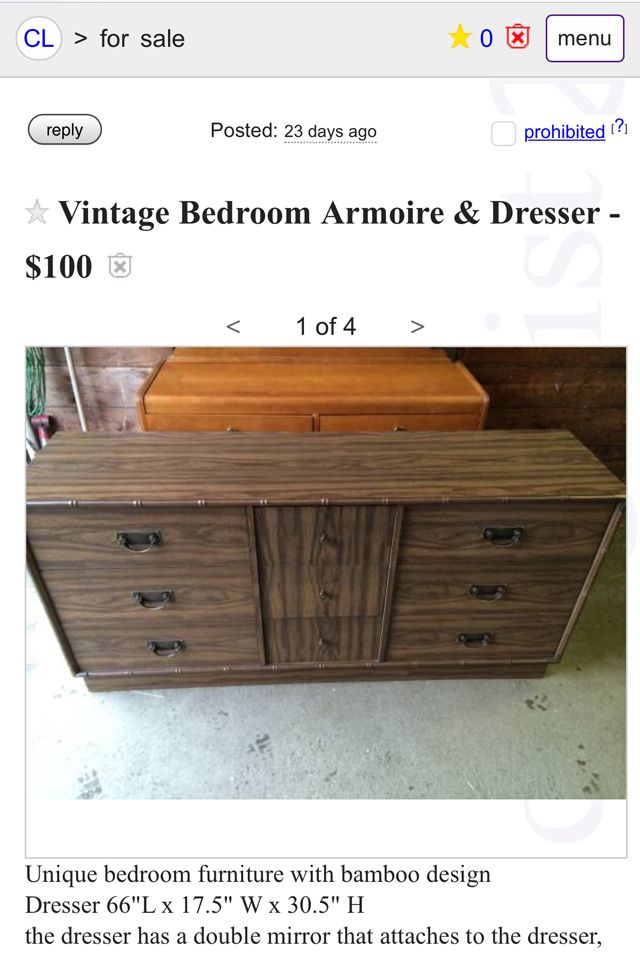
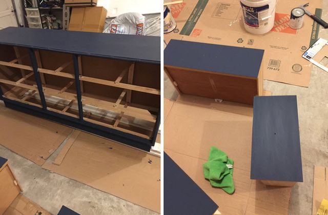
I know what you are thinking! That does not look like your inspiration photo Nancy ... and you are right. But I thought there could be a bit of potential if I could just cover up that sad veneer. I ended up getting the dresser for $85 Canadian dollars (which is like the equivalent of $3 US haha) so I knew I had not much to lose in trying. I turned to the FAT Paint Company's Navy State of Mind from the Amanda Forest Collection after seeing many other great DIYs online.


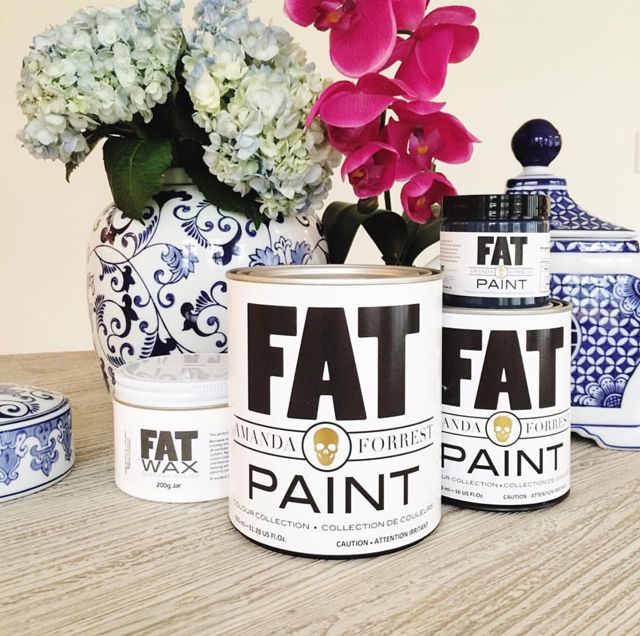
Because I was working with a smooth veneer surface, rather than a natural wood, I had to prime. Normally with FAT Paint you can skip this step, but I needed to ensure MAX adhesion to a slippery surface. What I ended up using was called a gripper primer (many brands make this) that is meant for outstanding adhesion to glossy surfaces. After that initial step I followed the how-to instructions on the FAT Paint site. Tips I'd pass on if you are wanting to try a project like this is 1) don't use a foam roller, the paint works best with a soft fluffy roller meant for smooth surfaces 2) don't sand inside, the dust will go everywhere 3) multiple thin coats is best!

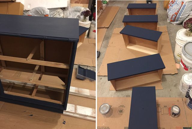
You'll see on the right below that I began sanding the drawer-fronts, and normally with wooden furniture the sanding creates an ultra smooth finish to this chalk-style paint. Because my piece was covered in veneer the sanding finish was not exactly the look I was going for as you could see some visible streaking, so I opted to leave the drawer fronts un-sanded and instead applied a FAT Paint natural wax coat to achieve a finished look.


I painstakingly painted on the gold trim of the bamboo by hand (the word PAIN is in paint for a reason). And the results, (with a little glimpse into my dining room - more to come soon!):

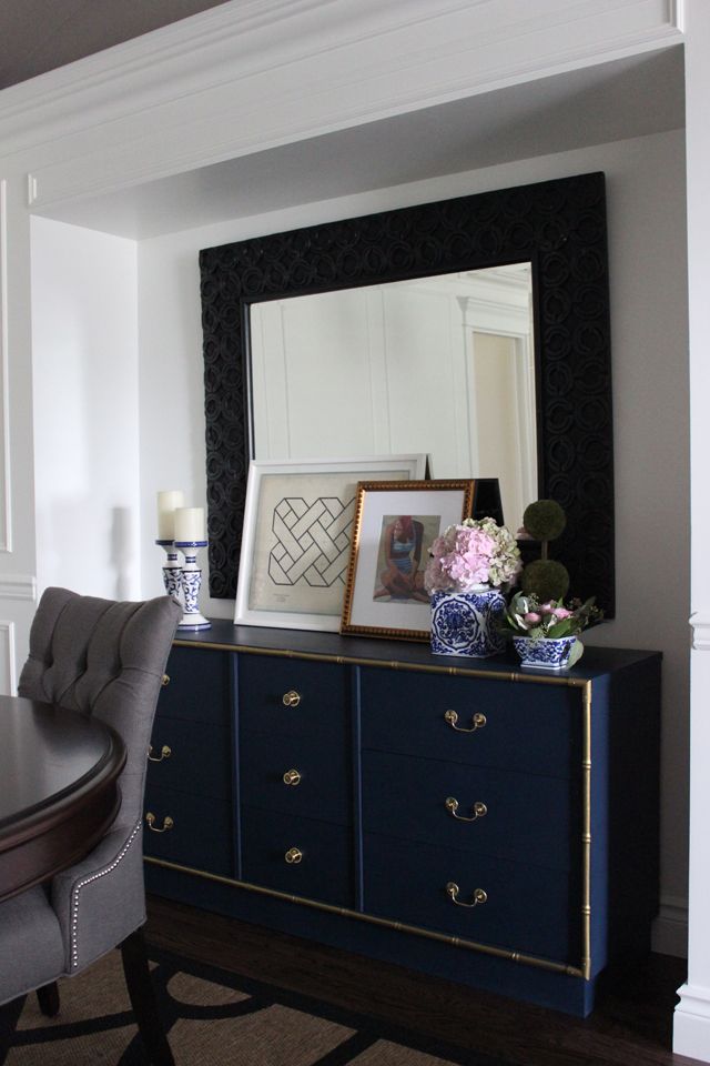
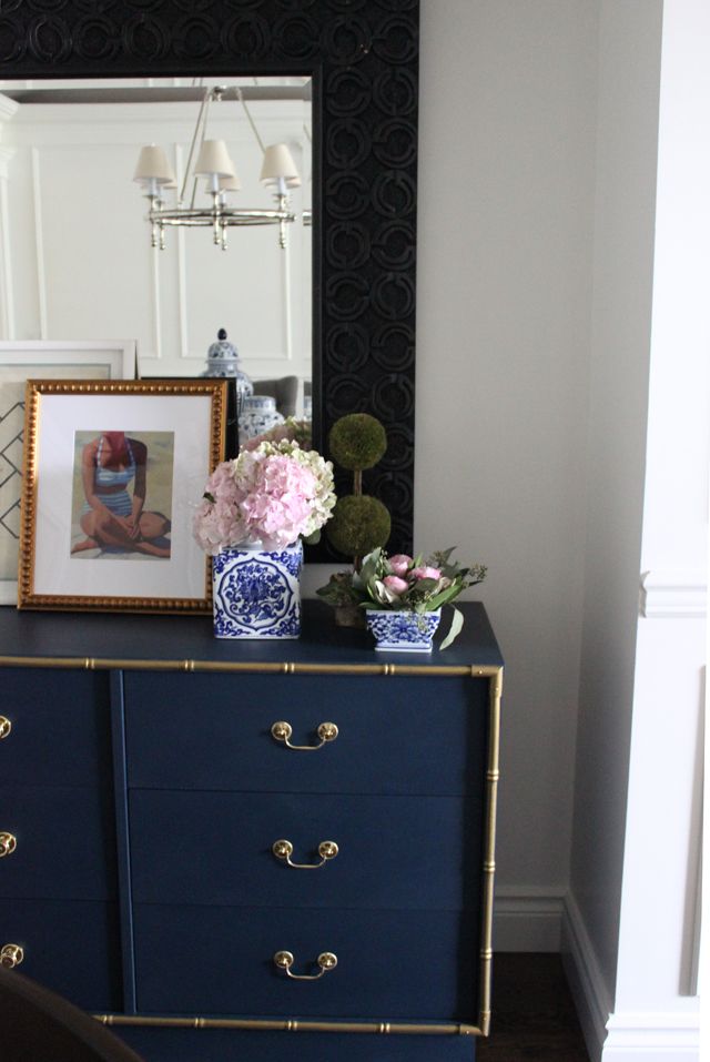
Gold hardware via Lee Valley, Beach Sunshine print via Artfully Walls, Jean Baptiste Geometric print via Kerrisdale Design Inc., mirror via Thomasville


That's my little teaser peek for now! And although my dresser was under $100 and will never be quite as stunning as my inspiration photo, I've achieved the look I was going for in the space and I am really enjoying it. I haven't accomplished many DIYs since baby Marcus was born but I feel like the work of painting this dresser was well worth the effort! What do you think, would you add navy to your dining space?
PINTEREST    |    INSTAGRAM    |    TWITTER    |    FACEBOOK    |    BLOGLOVIN

Wednesday, November 9, 2016

One Room Challenge Week 6 | The Final Reveal


Here we go, the big reveal day! Thank you for stopping by, and if you are new here I hope you will stay & have a little look around. My name is Nancy, and I'm a design enthusiast who has been blogging since 2010, first as a bit of an escape from the pressures of grad school, then as a way to document reno #1, and more recently reno #2 (more on that front soon!).

First off a huge thank you to Linda of Calling It Home (she created this amazing challenge!), thank you to House Beautiful for sponsoring, & thank you to all the amazing partners that helped us beautify the space. I count myself pretty darn blessed to have been part of this ORC. Now, I'll let the "before" & "after" photos speak for themselves, and I will reference sources throughout as well as a complete list at the bottom of this post. (All photography of the "after" space was taken by the lovely and wonderfully talented Tracey Ayton - if you are a designer located in the Greater Vancouver area you will want to get familiar with her stunning work as soon as possible! Thank me later).

Here is where we have come from, the 'humble beginnings,' so to say:


And now to THIS:


So many things to love! I just adore the claw foot tub and the flanking stools, with such a practical function beyond all the pretty. Because this room gets a lot of light the grey Romans from Tonic Living were a favorite addition, they'll save a few Chanel lipsticks from melting in the summer sun! (Sources: Paint color is BM Oxford white, Roman shades, garden stool, white banded towels, Freeport Turkish towel, faux ostrich stool, orchid cache pot).


The shower was once a dark and dingy space, boxed in with a thick metal frame:


Now the glass carries up to the ceiling, increasing visual height tremendously! (Sources: French accent chair, Pyne Hollyhock pillow, Aurum sand No. 3 artwork by Julia Contacessi, Turkish towel).


And I can't get enough of the reflection in the gorgeous gold beaded mirrors, that Arianna Belle pillow is eye-catching from every angle:


Many of you have asked about the materials used in the space. I think we've successfully mixed marble with man-made porcelain and quartz for durability. Here's a little list for you, all purchased through Creekside Tile: shower walls are porcelain marble 12x24 in Verona Calacatta, shower base is moonstone polished, backsplash and shower inset are 1" hexagon in Calacatta, basket weave on main floor is Oriental white and moonstone, and pencil trim is Calacatta.


Where there was once a large builder basic mirror:


We now have the airy & polished appearance of two side by side mirrors:


Because we weren't venturing into electrical work on this project, I had to get creative to visually fill the space between the 2 mirrors. In came this stunning Currey & Co. brass and marble lamp from Bellacor, which will actually provide an extra layer of lighting in the evenings. To me it feels like the perfect solution when a wall sconce is not possible! I followed their helpful Lamp Buying Guide to make sure I had the right sense of scale for it's needed function. And I'm thrilled with the mixed metals in the room as well:


I also really wanted to have a hand in the tiny details of the space. I added one more dash of blue & white with this lovely wallpaper called Three pm from Milton & King as a drawer liner. Why not wake up to a burst of pretty pattern every morning?


The overmount sink & tile counters were difficult to keep clean in the old bathroom:


And now it's like a dream! Our pick of vintage style cross-handles on the faucets added charm (Sources: faucets, knobs):


Another vintage element is the tub caddy - again, form meets function!


This handmade-to-order orchid cache pot from Jill Rosenwald is like the icing on the cake. It's so gorgeous, and it's these subtle touches that make a room special. You can select your color for every one of her stunning handmade ceramic pieces - I just want to make these my Christmas gift to everyone I know!!


A huge sigh of relief! And a big thank you to the generous ORC sponsors who helped provide key décor elements.

 Gold beaded mirrors (Lamps Plus) | Aurum Sand No. 3 art by Julia Contacessi (Minted) | Roman blinds and Freeport Turkish towel on tub (Tonic Living) | Grey-banded cotton towels (Annie Selke - Pine Cone Hill) | Pyne Hollyhock pillow (Arianna Belle) | Orchid Cache pot (Jill Rosenwald) | Brass & marble lamp (Bellacor) | French accent chair, blue & white garden stool, Tub caddy and Tissue holder (ATGSores) | Turkish towel on hook and Faux Ostrich navy stool (Joss & Main)

Thank you so much for following along, cheering me on through your messages here and on social media, I truly mean it when I say I feel blessed to be part of such a supportive & enthusiastic creative community. It enriches my life daily, so thank you to all of YOU! (And if you are just catching up you can view posts 1, 2, 3, 4, and 5 for the whole process).

I am so excited to check out the other 19 spaces today, it's been a pleasure to follow along with them and an honor to be part of this talented fall line-up:


Don't forget to also check in with the Guest Participants (literally dozens of gorgeous rooms to see!), and if you were watching things from the side-lines and wishing to give this crazy 6 week adventure a shot, think about joining in the fun for Spring 2017! xox

PINTEREST    |    INSTAGRAM    |    TWITTER    |    FACEBOOK    |    BLOGLOVIN

Wednesday, November 2, 2016

One Room Challenge Week 5 | Finishing Touches


Ok - I cannot believe I just typed that ... WEEK 5. Oh my. Here we are, with literally DAYS to go (we are booked for our photoshoot with the amazing Tracey Ayton this coming Friday!!!). It's full-on go time, and I have a few sneak peeks left to show you before the final reveal on November 9th. If you are visiting for the first time, thank you for coming by and I really hope you will be enticed to come and see the end result next Wednesday! (You can also see weeks 1, 2, 3, and 4 to catch up).

First up, the quartz counters were installed and they are lovely:


It really is a tricky thing to be mixing various pieces of real marble with quartz and porcelain, but I'm here to encourage you that it can be done! The key is to make sure you see large samples and everything together before ordering. Note the undertones, keep with all warm tiles or all cool in terms of color. See a slab of the quartz, not just a tiny square sample! The end result will be a durable and functional yet stylish space.


I love the hexagon marble mosaic! It's matching what you saw last week in the shower inset panel. We topped it with marble pencil trim for a perfectly finished edge.


And our Lamps Plus mirrors were installed! This pair added just the perfect touch of brass to help us warm things up, and I love that they are beefy & have a beveled edge, they look very substantial in person. A few other brass items will be coming in before next week to tie it all together.


And finally, the Roman shades! These grey beauties from Tonic Living are adding just the softness we needed, I can't wait to show you all three windows dressed up.

What's left:
- Vanity hardware
- Toilet & tissue paper holder install
- Hang artwork
- Clean and seal all tile
- Doll it up with all the pretty!


All the pretty includes:
 Gold beaded mirrors (LampsPlus) | Vintage style faucets | Aurum Sand No. 3 art print (Minted) | Roman blinds (Tonic Living) | Grey-banded cotton towels (Annie Selke) | Pyne Hollyhock pillow (Arianna Belle) | Orchid Cache pot (Jill Rosenwald) | Brass & marble lamp (Bellacor) | Tub caddy and Tissue holder (ATGSores) | Claw foot tub | Turkish towels and Faux Ostrich navy stool (Joss & Main) | French accent chair and blue & white garden stool (ATGStores) | Marble hexagon & basketweave tile 
I am so excited to see this space come to life in the next few days. I may not get much sleep however! I just love the look of softer furnishings in a 'utilitarian' hard space like a bathroom, so I particularly can't wait to see things like this chair from ATG Stores and pillow from Arianna Belle and everything else above pull it all together. Oh, and the hand made items!! The Jill Rosenwald orchid pot arrived and it's to die for (maybe that will entice you to take a peek at my IG Stories to check it out today)!
Wish me luck & please check out the other 19 designers playing along before their big finales:
PINTEREST    |    INSTAGRAM    |    TWITTER    |    FACEBOOK    |    BLOGLOVIN
Related Posts with Thumbnails
 

© 2010-2017 Nancy Marcus. All Rights Reserved. | Blog Design By Brittany Douglas