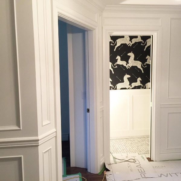
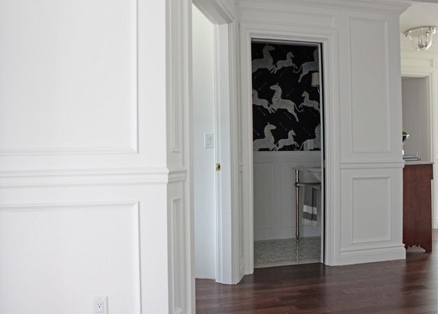
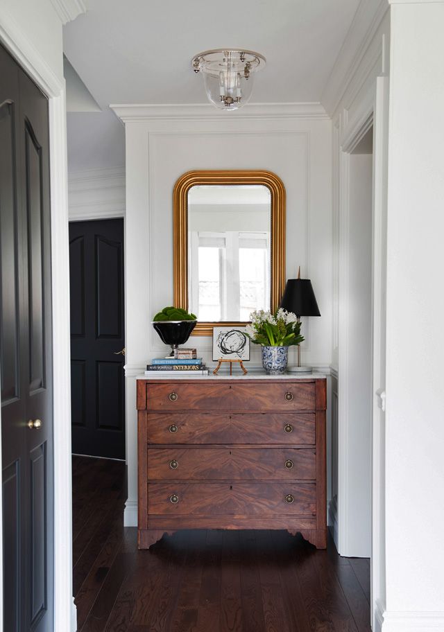
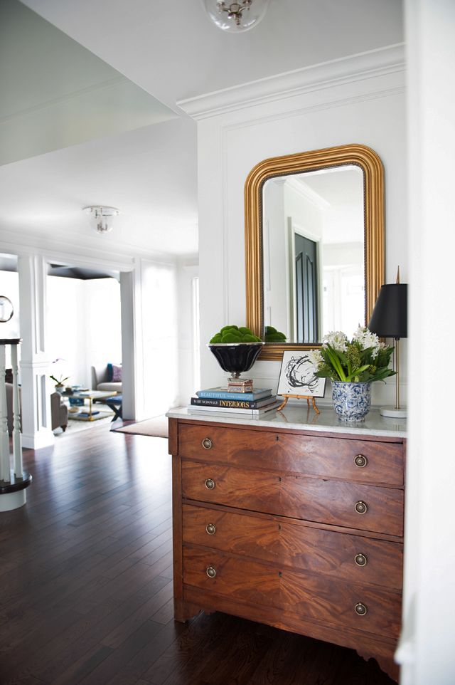
A new week, a new reveal for you! Thank you so much for all of your feedback on the entry reveal last week! I've got the full before & afters of our kitchen reno, of which I've previously shared our plans & progress here. Now, I know you've seen many-a-makeover out there that takes an old honey oak kitchen and magically transforms it to an all-white haven, but the difference with this one is we really really had to work with what we had. We couldn't afford new cabinetry, we couldn't change the footprint, we couldn't remove the ceiling drop between the eating area and kitchen. Trust me when I say my head was spinning with ideas for this space, sadly most of which were just too lofty to make happen. So, we had to be CREATIVE on a massively tight budget.
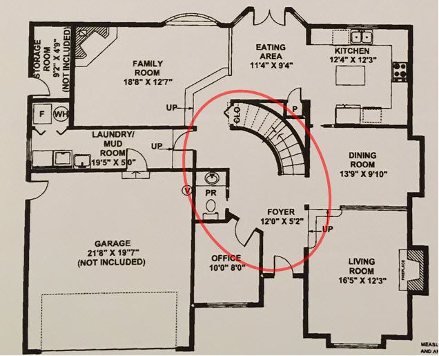
If you've been following along over the past year you'll remember that I completed the breakfast nook as a One Room Challenge in the spring of 2016, and that portion of the room has only moderately changed with new artwork and styling (updated pics below). So let's start with the blueprint so you can get a feel for the shape of the space:

An a full shot of the before:

First order of business was remove the yucky box lighting:

And then, one of the major changes we implemented was to fill in the space above the uppers with drywall. This was approximately a 1 foot gap (I think 13 inches to be more accurate), and lucky for me my father in law is a drywaller so we were blessed to have this go up super quick:

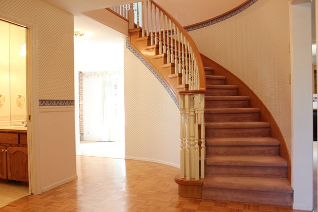
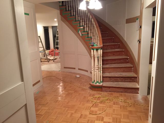
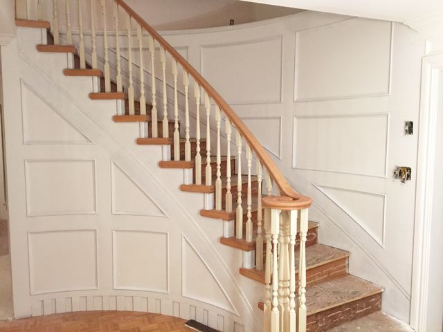
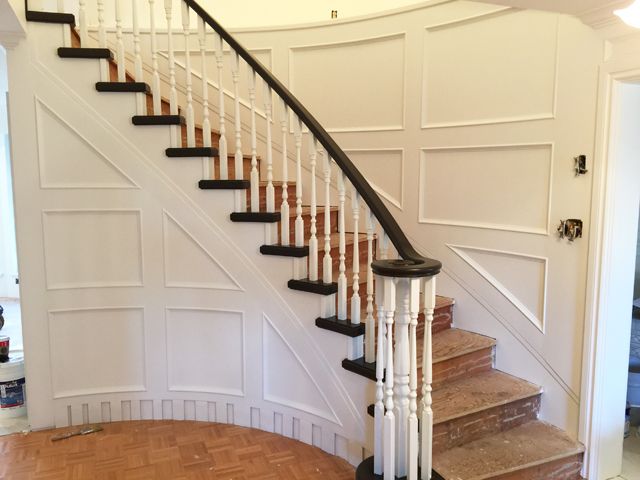
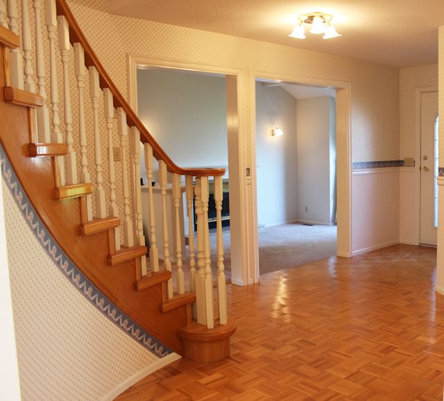
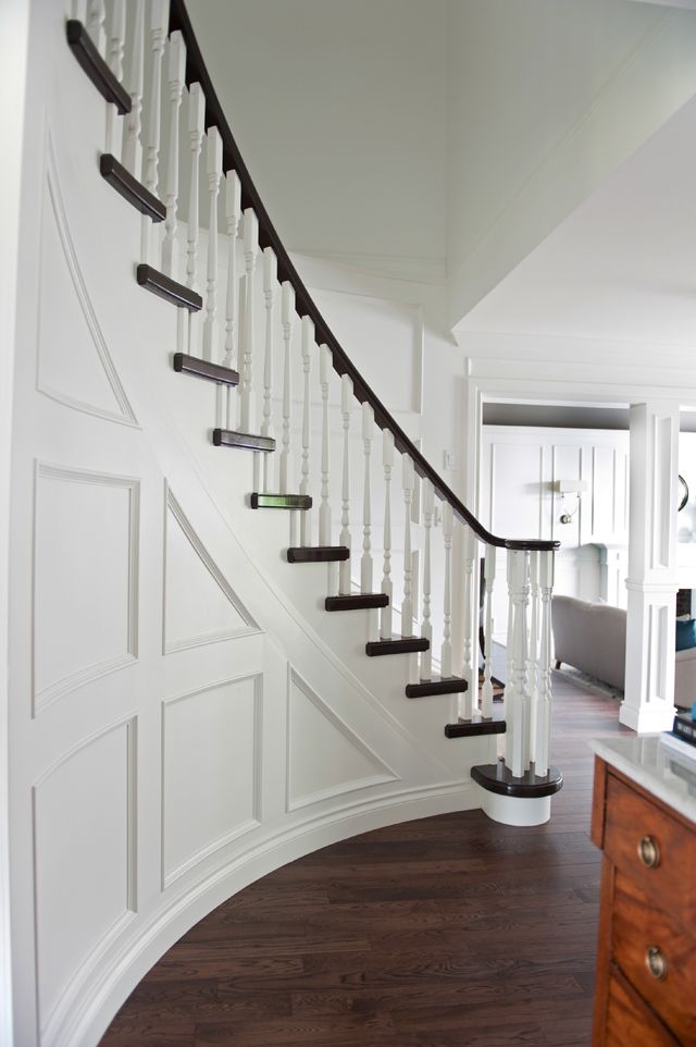
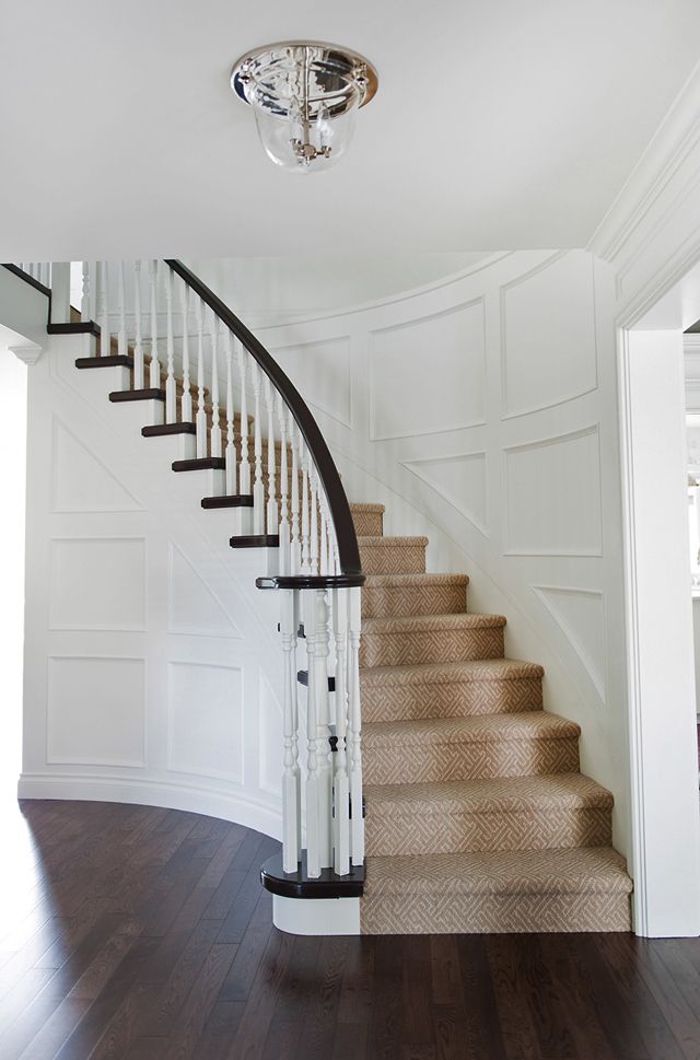
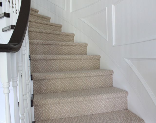
As you can see above the backsplash was also removed in a hurry :) On to the other major change, in the breakfast nook we got rid of the little half-banister (you can see it's between the french doors and the bay window) and raised the sunken floor to create a much more open space:


Another eye-sore in the space, you might remember this one from my ORC, swapping out the funny little lonely cupboard for a real pantry door, we purchased a Masonite shaker door (brought to you by Metrie):

And then once those few basic changes were made I drew up a moodboard to help direct me. I knew I wanted to change the door fronts on the cabinets, it was the cheapest solution to changing the 80's cathedral curved shape of the oak doors. In total new shaker style doors in oak cost us $1200 to purchase. That's a lot less than a whole new kitchen.

And soon things began to take shape. The calacatta 3x6 tiles made a big impact:

The jewelry of this space is by far all of the polished nickel finishes. I was doubtful on whether a potfiller was necessary, but once we selected the Brizo Traditional pot filler I couldn't have been more happy. It only cost $200 for the plumber to run the cold water from the faucet behind the wall and to the stove, money well spent as I find most people who walk in this space seem to notice this feature right away.

I also knew I had to address the newly placed drywall above the cupboards so I played around with Metrie's products and came up with what I'd like to call a little 'trim sandwich' of sorts. I utilized Metrie 4 1/4" crown combined with French Curves Collection panel mould trim and a flat pine screen mould to cover over the gap between the drywall and top of the cabinet.

So finally, now that you've got a good idea of the details, here are some of the before & after shots side by side:


Photography by Tracey Ayton


Photography by Tracey Ayton

Photography by Tracey Ayton


Photography by Tracey Ayton

Photography by Tracey Ayton


Photography by Tracey Ayton


Photography by Tracey Ayton

Photography by Tracey Ayton


Photography by Tracey Ayton

Photography by Tracey Ayton

Photography by Tracey Ayton

Photography by Tracey Ayton

Photography by Tracey Ayton

Photography by Tracey Ayton
Metrie - 4 1/4" crown combined with French Curves Collection (Scene I) panel mould trim and pine screen mould, door casings and baseboards from the French Curves Collection (Scene I)
Masonite (brought to you by Metrie) - Pantry door
Brizo - Talo SmartTouch Technology faucet & soap dispenser, Traditional pot filler and Traditional 18" towel bar
Circa Lighting - Darlana Lantern
Robinson Lighting - Island pendants
Creekside - 3x6 Calacatta polished tile
Craigslist - Rattan chairs
Bombay & Co - Blue & white tableware and vases
IKEA - Placemats
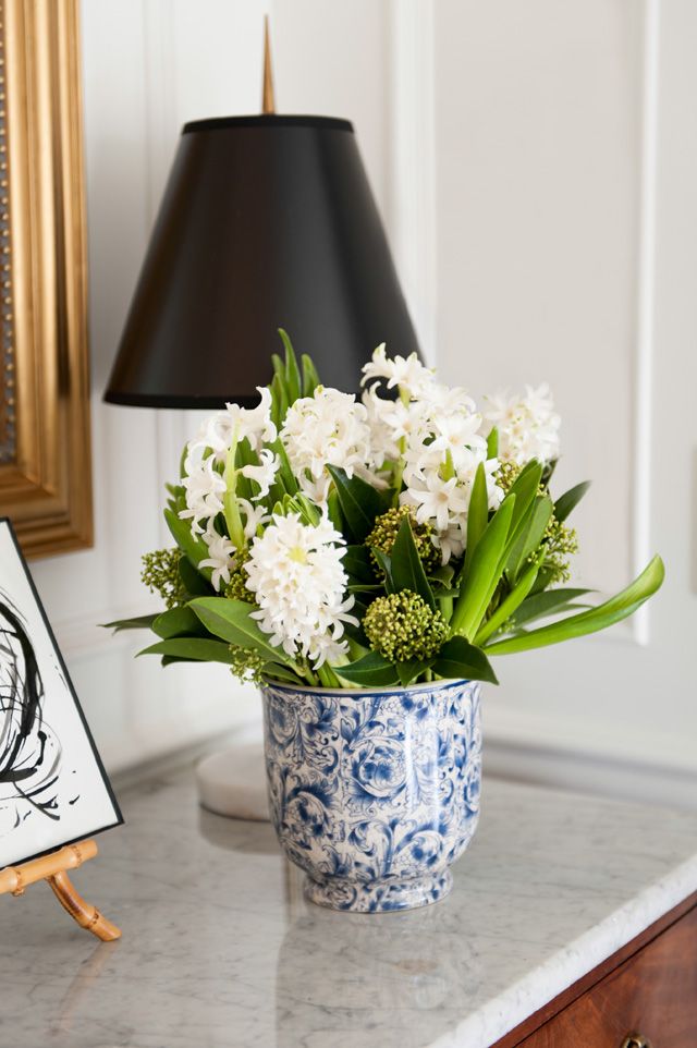
Flowers and Company - Florals and Myrtle plants
Benjamin Moore - Cabinetry and trim is painted Chantilly lace (pearl finish), walls are Chantilly lace (eggshell finish)
Kentwood - Oak Lynx engineered hardwood flooring