Monday, November 23, 2015

Reno Project Update | Kitchen Progress (With a DIY Twist)


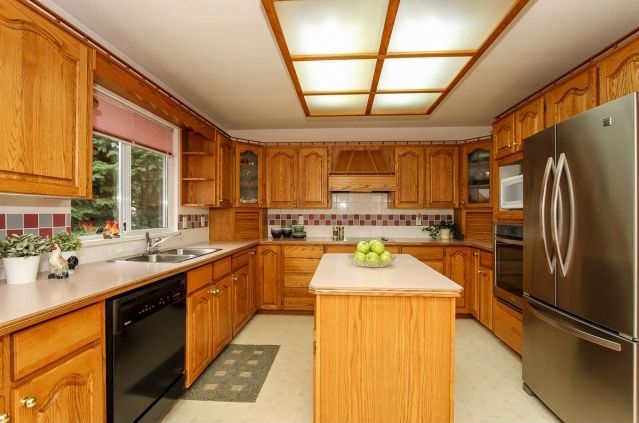
Another week, another progress post for you! This time I'm honing in on the kitchen - the heart of the home. Above you can see the real estate photos as the kitchen appeared when we toured & purchased the house. Fairly typical layout, wood box fluorescent lighting, and the same oak cathedral-style cabinets that I had to tackle in my last home! They're following me!!
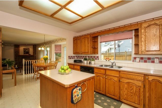

You can see the kitchen is separated by a bit of a partition in the wall, however due to the fact that this is a load-bearing archway, we opted to leave it alone as we knew our budget was tight. The kitchen is a space that can suck-up budget money (and fast!) so I knew I had to get creative on a few aspects in order to make it work without blowing it all in one space. The kitchen really turned out to be a lesson in learning which items to save on and which to splurge on to get the highest design and function impact, and of course the most bang for our buck.
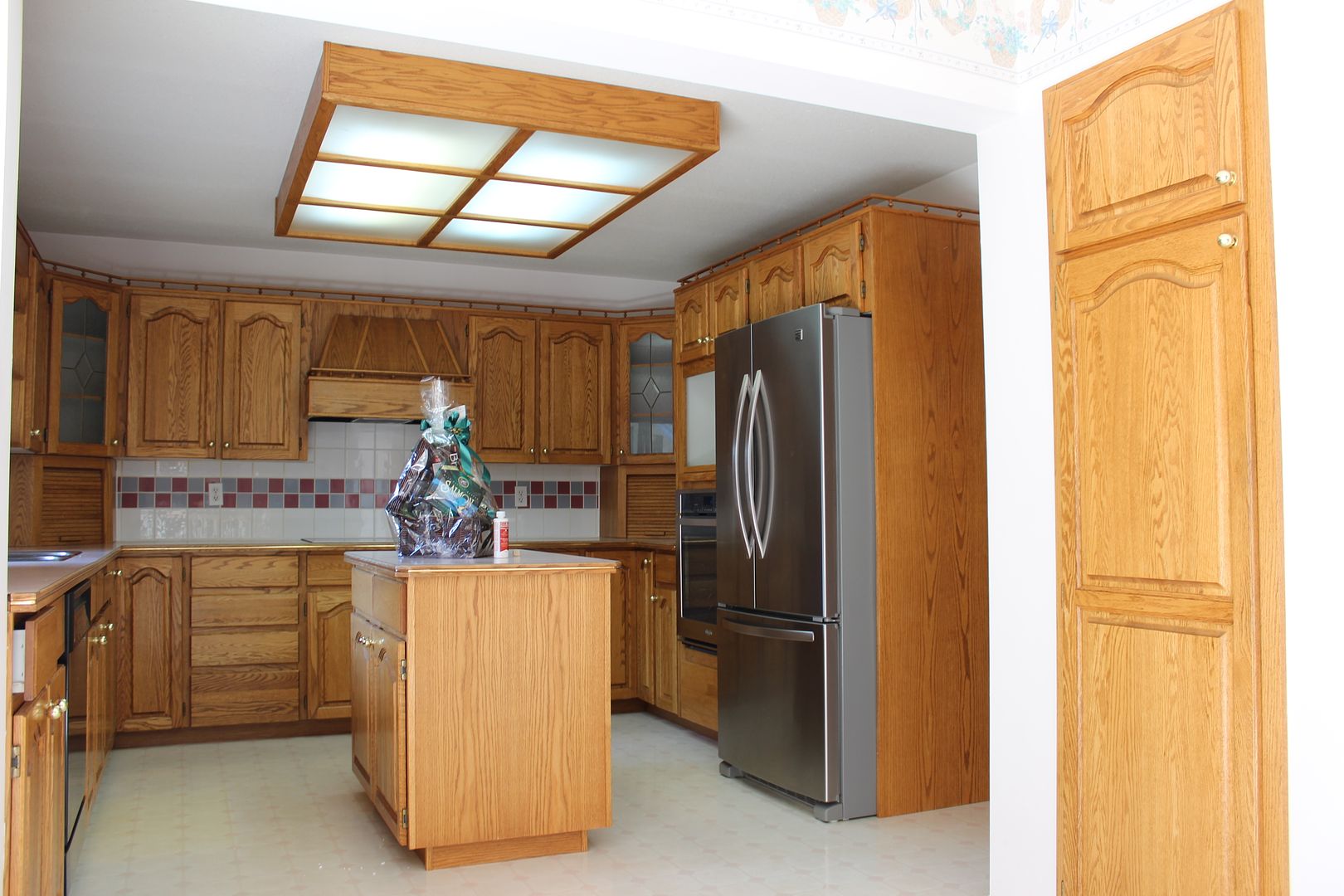

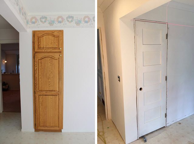
Above you can see a spanned out view past the archway, there was this super-awkward and random cabinet door off on one wall (to the very right of the image), that opened into a mini-pantry. It looked totally out of place! Another problem to tackle. And of course one of the first things to go was the box-lighting:
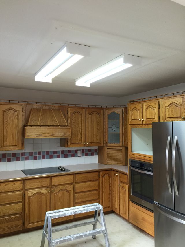

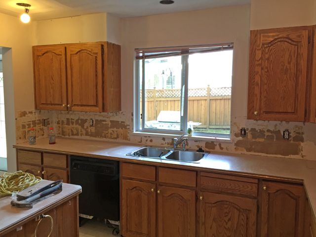
Then we started to rip out portions of the cabinets, the little open shelves on either side of the window, and the decorative wooden-dowel railing off the top:
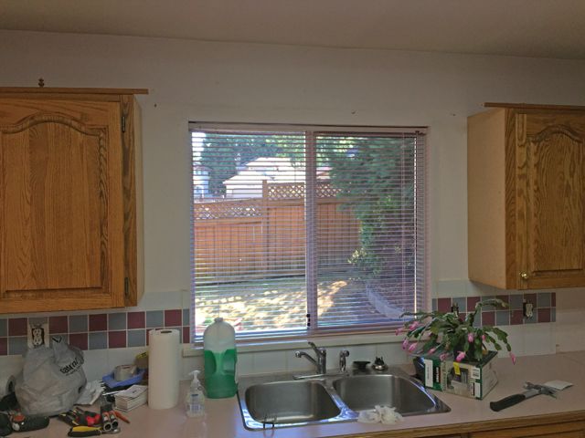

So now to get crafty. I couldn't afford all new cupboards, and I hated the empty space above the cabinets! Enter in my father-in law who just so happens to be a dry waller and was kind enough to appease my crazy ideas. We boxed in the cupboards to the ceiling with drywall!


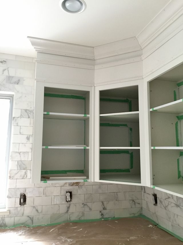
And now for the dramatic side-by-side, we wanted this boxed-in drywall header to appear as a natural extension of the cupboards to the ceiling, so with the help of Metrie and their incredible trim and mouldings, we created a polished and modern look using a crown, panel mould, and screen mould build-up:
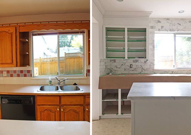

The trim finishings will also be wrapped around the cabinet on the far left to meet flush with the new Calacatta backsplash. We painted everything out in BM Chantilly Lace, and ordered new oak shaker-style door fronts (and at a whopping $1200, this budget-friendly alternative was a steal!).
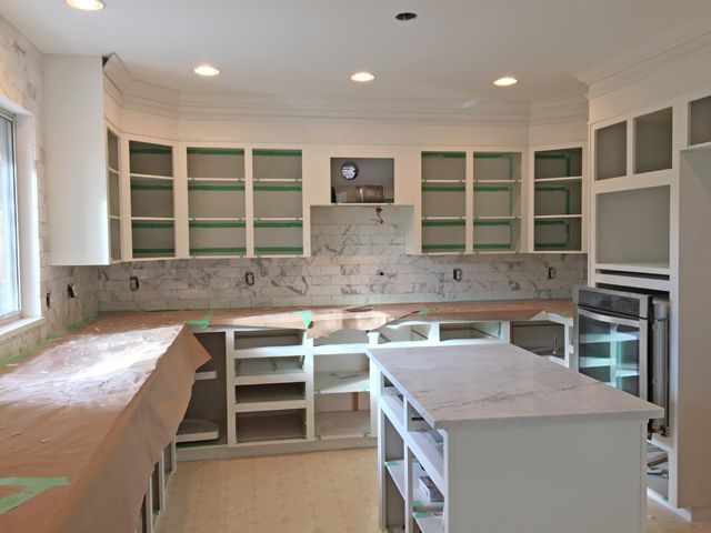

Another close up of those gorgeous Metrie pieces, we utilized 4 1/4" crown, combined with French Curves Collection panel mould.

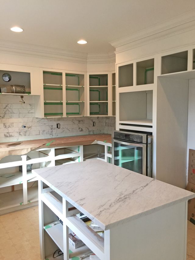
Bright pot lights in place, and a lovely marble island counter that I'm sure we will stain like crazy, but I'm so excited to have!

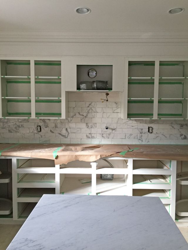
This spot is going to have the wooden stove hood returned once painted, and a stunning jewelry-like Brizo Traditional pot filler on the wall! I can't even believe I'm going to have my very own pot-filler, is it weird to say that that's the stuff kitchen dreams are made of? It'll be paired with the new SmartTouch Technology faucet that I so cannot wait to test out, no more dirty hands touching the faucet lever!

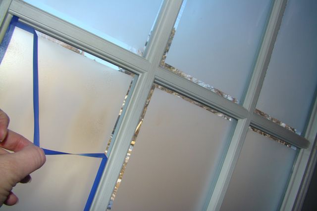
I've also got French doors going in within the eating area, more on that to come soon! I plan on a little DIY using a frosted self-adhesive product from d-c-fix that can be removed and reapplied multiple times without leaving any sticky stuff behind.

The yucky pantry door before & after - we chose a Masonite wood 5 panel shaker door to keep things looking clean and modern:

Some of the items going into our kitchen space are linked below, more to come soon! Thank you for following along with our adventures in renovating ;)
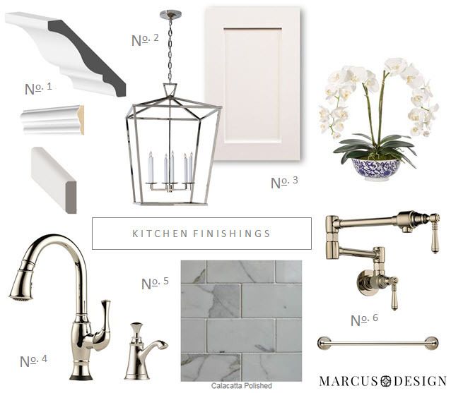

No. 1 - Metrie 4 1/4" crown combined with French Curves Collection panel mould trim and pine screen mould | No. 2 - Circa Lighting Darlana Lantern | No. 3 - Shaker cabinet fronts | No. 4 - Brizo Talo SmartTouch Technology faucet & soap dispenser | No. 5 - 3x6 Calacatta polished tile | No. 6 - Brizo Traditional pot filler and Traditional 18" towel bar

PINTEREST    |    INSTAGRAM    |    TWITTER    |    FACEBOOK    |    BLOGLOVIN

Monday, November 16, 2015

Reno Project Update | Living & Dining Room Progress


Here we go everyone! A post LOADED with before & progress shots for you today (finally!). It's been mayhem between growing a baby, working full-time, and climbing this mountain they call "renovation." Just for future reference, these things should never be combined - scary stuff my friends, scary stuff.

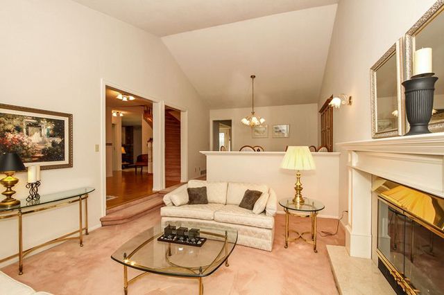
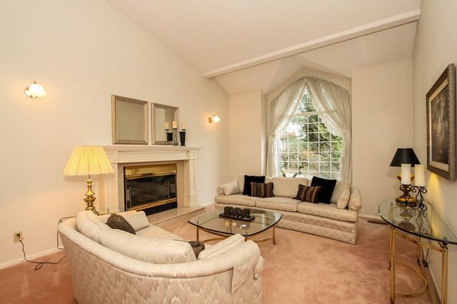
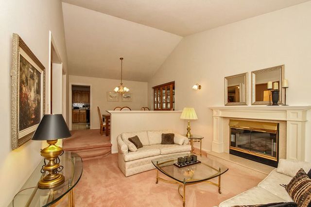
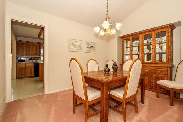
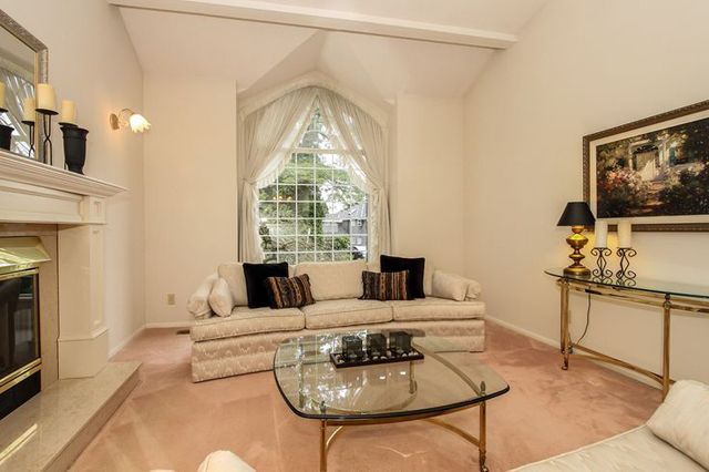
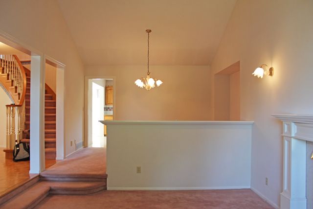
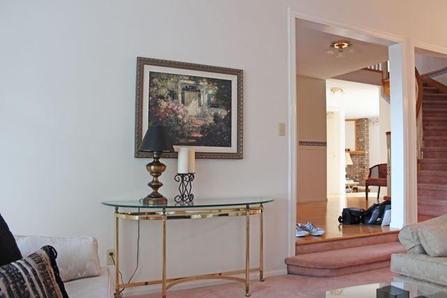
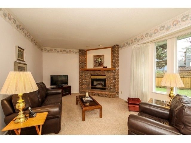
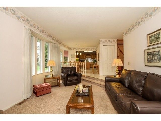
All jokes aside, we are finally feeling like we are getting somewhere :) I want to start with the beginning of the story for the living/dining space - a large scale room that you see immediately to your right when entering the front door of the home. Here are the legit 1989 befores (the real estate photos we viewed when purchasing the home back in May):


Ok - so now you get the feel for the awkward step down, the pony wall separating the two spaces, the big bare-ness of the vaulted ceilings with zip-zero soul or personality. I think that was the point that bothered us the most, this was a large space, with loads of potential but it appeared so bare and boring with literally NO architecture. This quickly became our main plan and priority for the room! In our last home, we saw that the efforts we put into panelling a few feature walls was a huge appeal, and a major selling feature that we strongly believe got us the most bang for our buck, an investment that was so worth it.

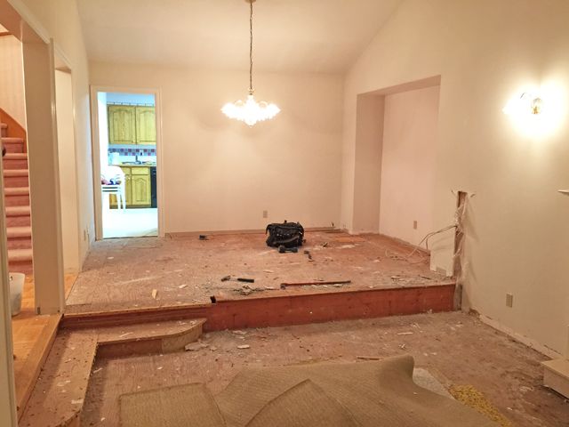
First thing to get knocked out was that darn pony wall:


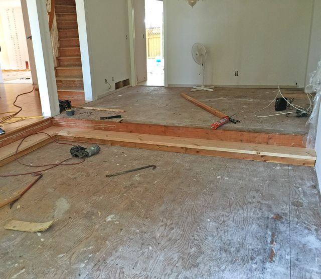
We rebuilt the step going all the way across the room instead (imagine these all covered in gorgeous oak wood flooring!!):


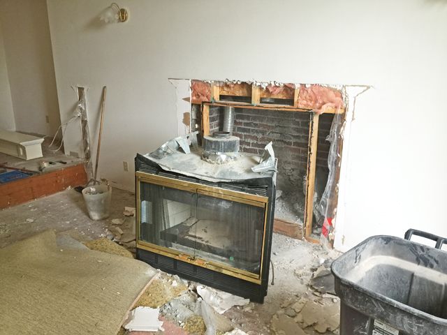
Carpets were of course ripped up, and the gas fireplace insert was removed. Lucky we pulled it out as we discovered a water leak in desperate need of repair. That's the not so pretty part of renovating, and it's been bumps in the road like these that have really added to our overall timing.

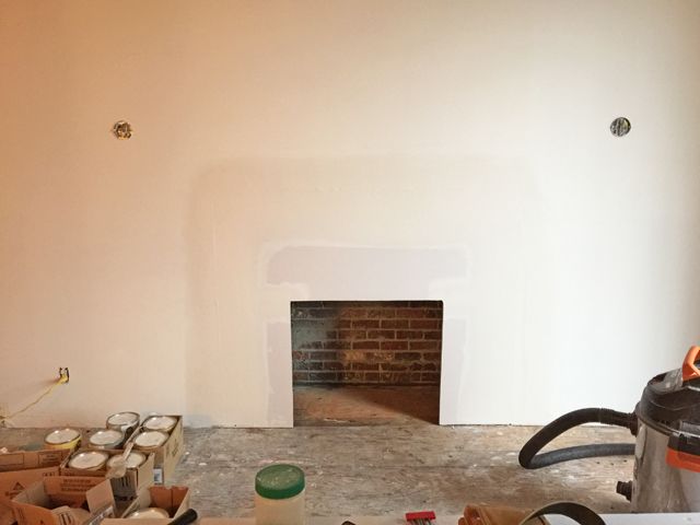
We chose to conserve the old mantel as it is in good condition, and with a new brighter white coat of paint I think it's going to work well with our vision:


Notice how far apart the sconces were on either side of the mantel? It was too widespread for my liking so I had our electrician bring them in closer on either side before we closed everything up with drywall again:

Then I started my hunt for inspiration. There are so many things you can do with a vaulted ceiling, I wanted to try something a bit different, not just faux wood beams, or bead board as you've likely seen in many spaces. Paint out the ceiling, create a tray ceiling that breaks up the wall with crown, and go heavy on the trim and moulding on the lower portion of the wall - these were just the interior finishings we needed!

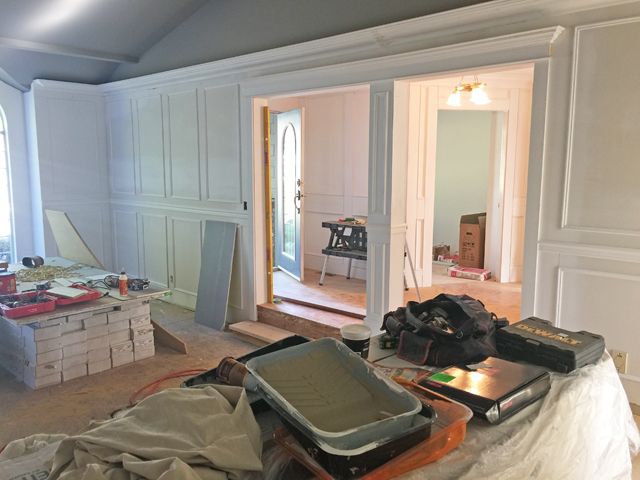
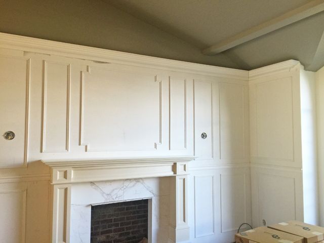
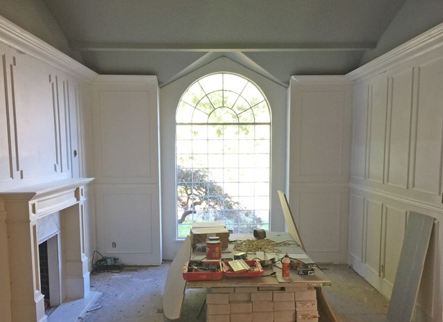
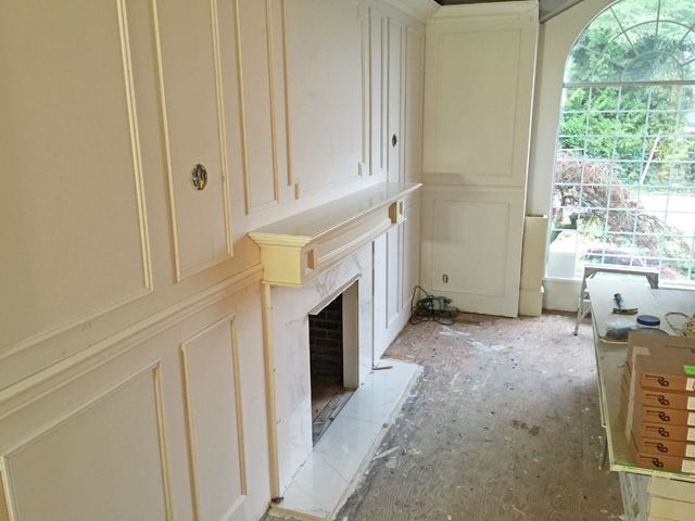
So we had the core of our plan, and we set out to execute it using the French Curves Collection from Metrie. Scene I of this collection suited exactly what I was looking for, young-traditional style with a perfect mix of ornate and contemporary elements. We chose a large-scale crown to encircle the entire room and began to panel the lower half with panel moulding. So for dramatic effect, remember it without any trim:


And now that same corner, voila!


We are head over heels in love with the transformation, and it hasn't even been filled or painted out white yet!!


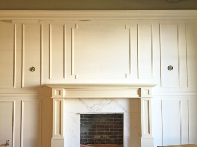
We added a little bit of framing detail above the fireplace similar to what you see in the photo below, I think that is the fun of planning and creating with trim and moulding, you can really let yourself get creative!


And even with an all-grey ceiling, the white will keep the room fresh and lively (I've selected BM Chantilly Lace which will be going up soon!).


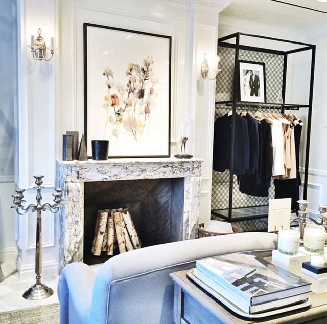
We are actually planning on leaving the fireplace non-functional but pretty for now, so in the coming weeks I'm going to be styling it up with sconces and birch logs much like this one from Club Monaco in NYC:


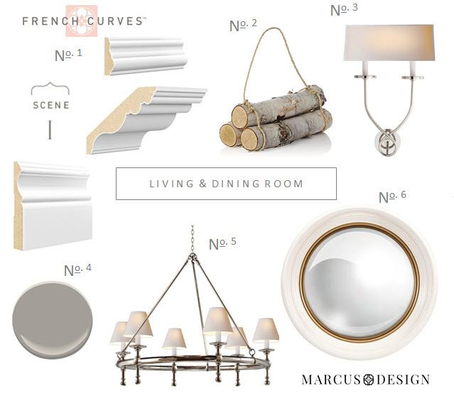
Can you picture it all? Here's a bit of a mood-board of my continued plans for this space so you can get a feel for where I am headed with it, much much more to come soon! And stay tuned for an update on kitchen progress in the coming week.


No. 1 - Metrie French Curves Collection Scene I, 7 1/4" Crown, Panel Mould, and 5 1/2" Baseboard | No. 2 - Crate & Barrel birch logs | No. 3 - Circa Lighting Symmetric Twist sconce | No. 4 - Benjamin Moore's Escarpment | No. 5 - Circa Lighting Classic Ring Chandelier | No. 6 - Lamps Plus Convex mirror


PINTEREST    |    INSTAGRAM    |    TWITTER    |    FACEBOOK    |    BLOGLOVIN

Monday, September 14, 2015

Gender & Nursery Reveal!


The past few months have been chaotic, exciting, overwhelming ... I could go on and on! As I recently posted, we are expecting a little one in January and our home reno is in full swing. Put those two life-changing events together and it's a little crazy. But thank God, we are doing our best and taking each day in stride. I KNEW I wanted to find out baby's gender before their arrival - I'm the kind of person that likes to plan and have everything prepped, and the thought of decorating the nursery was enough for me to know I had to KNOW! So we promptly planned for a gender reveal party with our family ... only the first ultrasound baby was shy and we couldn't see! Off we went to a 3D ultrasound, had the tech put the gender into a sealed envelope so we couldn't see it in the impersonal/clinical space of the office, and took it to a cake-maker so we could be surprised together with loved ones.

Before I was super-obviously sporting a bump, I also planned a family session of photos with Yaletown Photography ... knowing that this would be the last time before our family grew, and last fleeting moments of just Nick and I as a couple. It's a strange thing to feel fearful of losing the only thing you know, but also knowing you are going to be gaining something beyond your wildest dreams.


Ok, back to the cake! I know I'm holding you in suspense here ...

Hello World cake topper via The Swank Social

The cake-dots on the inside were BLUE .... baby on the way is a BOY!

Truth? I already had a design plan in mind whether baby would have been a boy or girl :) And while I promise this blog will by no means be turning into a mommy/baby blog ... I think nursery décor is pretty fitting around here. It's something I've long thought of WAY before I was even ready to begin thinking about having children of my own. Here's my mood board so far:


Chandelier via Shades of Light | Fornasetti Nuvolette via DecoratorsBest | Vintage Roadster via Indigo | Crib via Dwell Studio | Leather bookends via Serena and Lily  | Artwork via RH | Pillows here, here, and here
I'd like to do one wall in the Fornasetti Nuvolette wallcovering, back in July I posted on my obsession with this paper and *hinted* that I would be using it in a special room :)

And finally, a mix of pillows will be a must, I'm liking the idea of a sofa instead of a rocking chair (thoughts?) piled with pillows! We haven't chosen a name yet, but when we do I can pick out an initial monogram pillow to add to the bunch ... So what do you think so far? And one thing I'd love is for you to chime in on what you think a baby NEEDS and must be included in the room ... I'm pretty clueless on that front! Thanks for reading through this lengthy post ;)
PINTEREST    |    INSTAGRAM    |    TWITTER    |    FACEBOOK    |    BLOGLOVIN

Tuesday, August 18, 2015

Updates to Our Reno Project | The Family Room & An Annoucement!


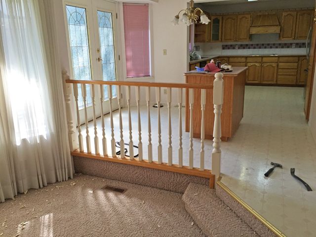
Hi everyone! I've finally put together some reno updates for you today. It seems every room in this 1989 home comes with a bit of a challenge and a backstory - the greatest of which would be the family room! As I mentioned to you before, this room was the one stumbling block that almost prevented me from putting an offer on the house! So needless to say I've been determined to fix that. Here's a reminder of how dated and cramped the space originally was:

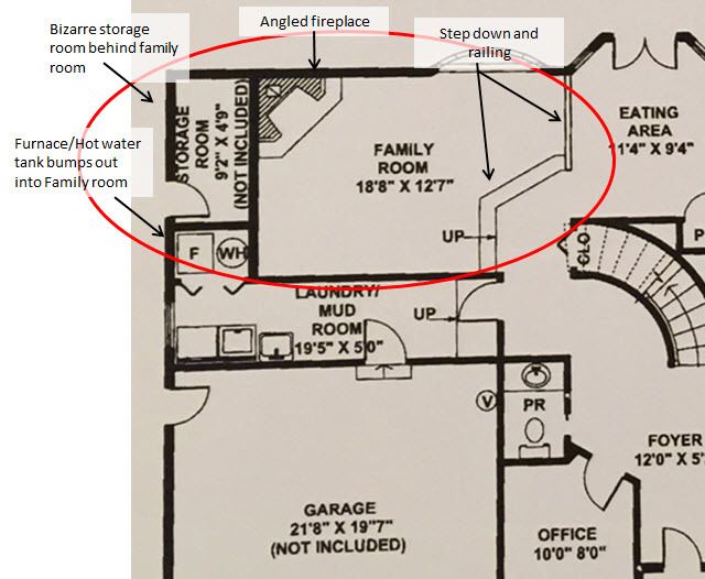
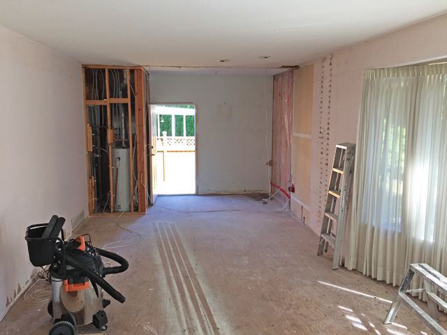
So if you look at the blueprint above, you can see that the space is cut with really awful angles - the angled fireplace on one side, and the angled step down on the other. This made for a tiny amount of space & an awkward plan to place furniture. Then we discovered a needless storage space directly behind the family room - with an exterior door! And we thought, JACKPOT! Knock a wall down and easily expand the space. Easy? No, nothing with a reno is really easy. With a closer look we found that the storage space did not go the full width of the family room ... a bump out with the furnace and hot water tank takes up the far corner (who places the utilities THERE???). So I knew we had to get creative.

We started by riping out the railing by the step down:


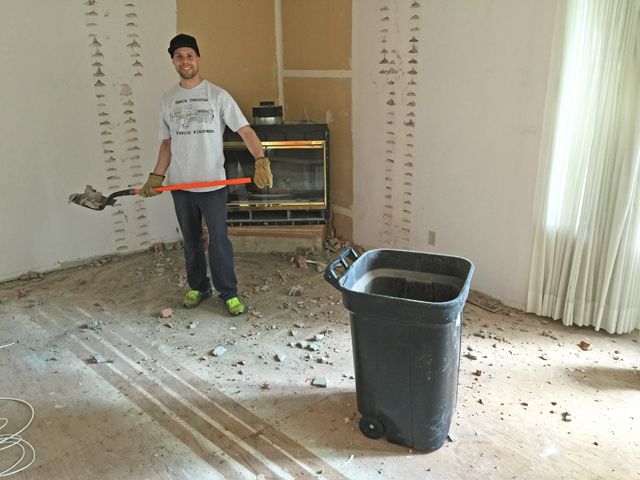
There's hubby working hard to remove the yucky brick fireplace, don't let that cute smile fool you, that was one crazy hard job!


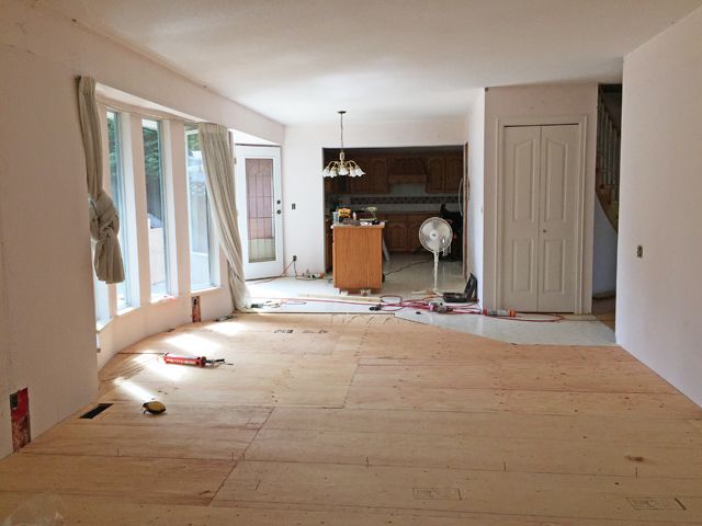
Carpets all ripped out:


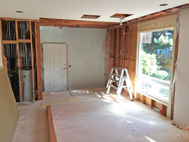
And now you can see the back exterior door once we removed the wall to the storage room that was once behind the fireplace. See that bump out? In a perfect world I of course would say move the utilities!! But alas, too pricey to move the furnace so we needed to improvise!


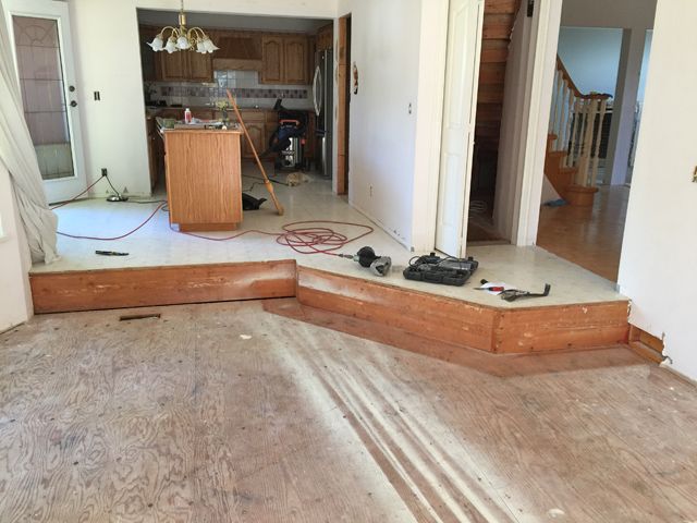
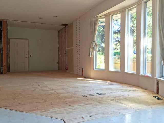
One helpful improvement - increase the flow of the space by raising the floor and getting rid of that darn step down!


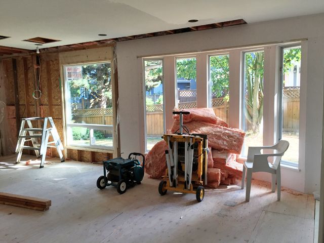
Next thing on the list, more light!! TA DA - a nice new window in what will soon become the back corner of the room:


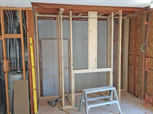
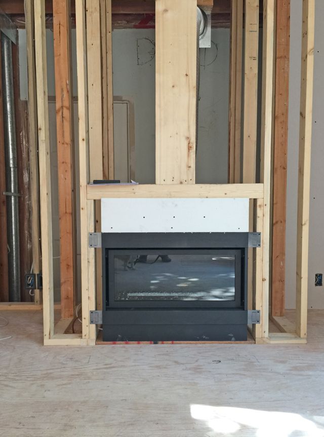
So in the space with the bump-out, we chose to create a built-in with a new gas fireplace that goes back into the storage space rather than into the already small family room. This way we don't eat up any of the gained space. This will also be nearly flush with the bump out in the left corner, hopefully blending it in on the back wall:


New linear fireplace came in yesterday! Woo hoo! Now I've got to design up a mantle and surround.


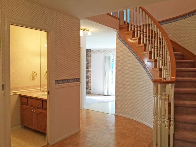
The previous view from the foyer - a peek of the old brick fireplace:


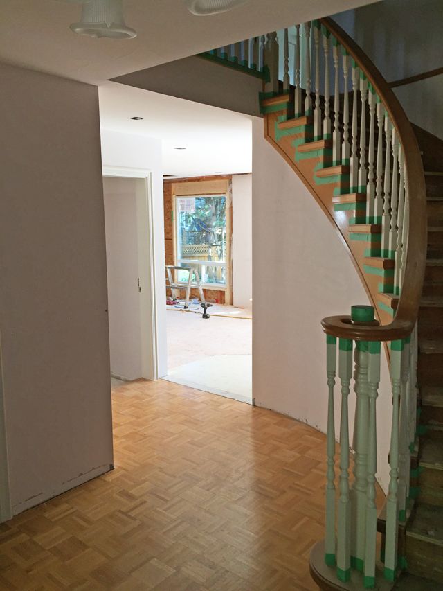
And now - nice and bright sightlines from the doorway! So what do you think so far?


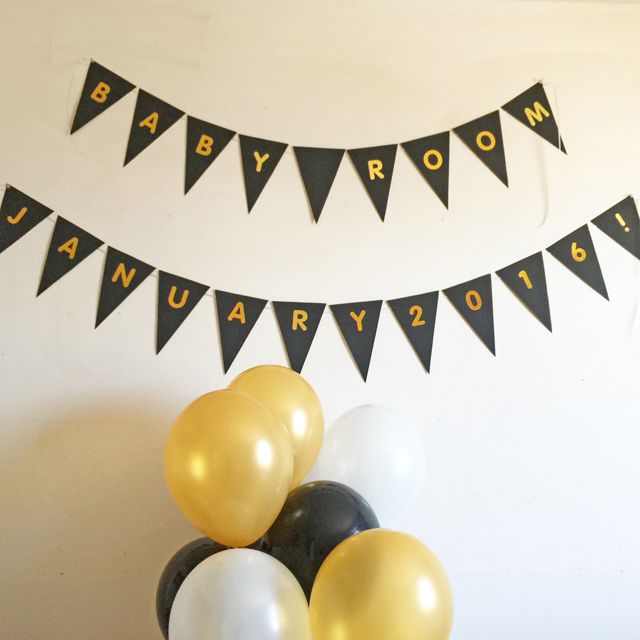
Oh and one more added room to the reno project I've been dying to tell you about (if you follow along on Instagram you've likely already seen this):


Eek! I sort of can't believe that everything is happening at once, it was a lot to wrap my head around at first but we are super excited and I actually hit the #20weeks mark today :) Stay tuned for some serious nursery planning! I've already got lots of ideas up my sleeves. Thanks for reading the whole way through this long-winded post ;)


PINTEREST    |    INSTAGRAM    |    TWITTER    |    FACEBOOK    |    BLOGLOVIN
Related Posts with Thumbnails
 

© 2010-2017 Nancy Marcus. All Rights Reserved. | Blog Design By Brittany Douglas