Monday, September 11, 2017

HGTV Takes a Tour of Our Home


I'm excited to share that our home tour is featured on HGTV Canada's website today! I love the title they came up with and I find it very fitting: 'An '80s Vancouver Home Gets a Bright, Pattern-Happy Makeover.' It's always interesting to hear how others perceive and analyze your own home - I thought, boy if only they knew how much MORE pattern and color I am planning to add and layer-in as I continue with these rooms and the rooms that have yet to be completed!

And while I know you've seen the majority of the images from the HGTV article on this blog, I actually haven't posted the updated photos of Marcus' nursery here. At the time of my One Room Challenge, in desperation to finish up I took photos myself. Having Tracey Ayton come in and take professional photography of all of these rooms, including a re-take of the nursery, was such a huge blessing and I'm super thankful for her talent and fresh eyes to see the spaces in ways I hadn't before.


The article mentions that my home office (pictured as a closed door in one of the shots), is next on my decorating to-do list; the truth is it feels like SO many rooms are next on my list. Flooring and paint has been completed everywhere but we now have to decorate the Master bedroom, the upstairs hallway, and the family room. We still have construction/cabinetry needed in the Master closet, laundry room, and home office, and a FULL reno of the 1980's Master ensuite (the big-ticket item that may take a bit of time to save our pennies!). The exterior has had shingles replace the old tired stucco, but we have a bit more to do out there too. That's a whole lot more spaces to work towards and I look forward to documenting it all here with you.

To see more images, read the whole interview, and see the sources listed, head to HGTV.ca  here. An extra special thank you to Christy Wright who authored the article and made me sound way cooler than I actually am :)

(All photography courtesy of Tracey Ayton)

PINTEREST    |    INSTAGRAM    |    TWITTER    |    FACEBOOK    |    BLOGLOVIN

Thursday, June 29, 2017

Reno Project Reveal | Powder Room


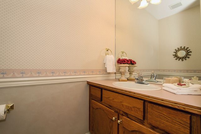
Today I have the chance to share the before and after of our little jewel-box powder room! This is a fun one for me personally because although this is a tiny space of very few square feet, I didn't have a powder room in my last home and so I really embraced the opportunity to go bold. We'll start with the before; here is an image from the real estate listing, you can see the (stubborn to remove) wallpaper that was in place since 1989.  Red oak cabinet, wall-to-wall mirror & tulip-style builder basic light fixture were all original to the house.

(You can view part 1 and part 2 of the powder room reno with all the plans and inspiration along the way).


The mirror, vanity, linoleum flooring, and lighting were all removed:


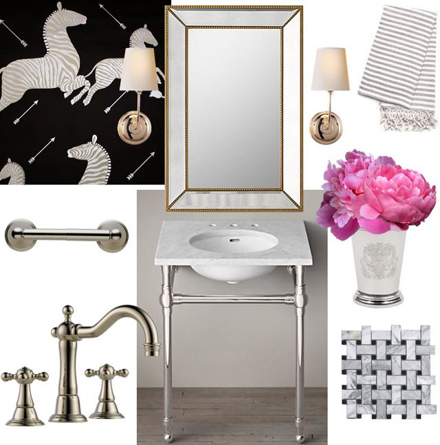
The only catch was (as you can see in my moodboard below) we selected a metal washstand that exposed the floor, but our water supply came up from the floor, so we had to get our plumber to moves those pipes into the wall before we could move forward installing our vanity. Often times, every step forward has 1-2 steps backwards before you can get to the pretty stuff! 

Here's the complete list of sources I selected:


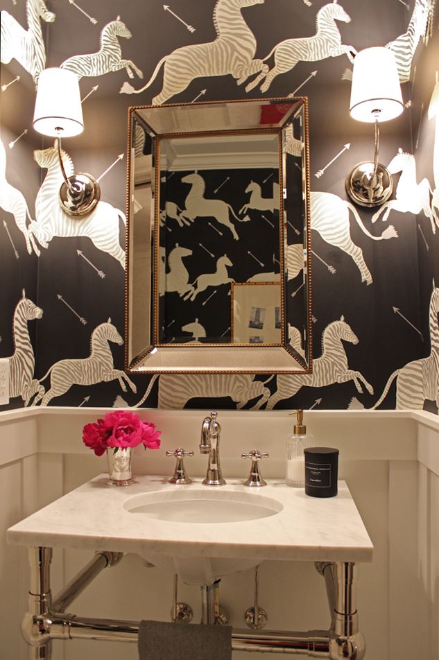
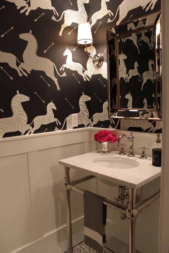
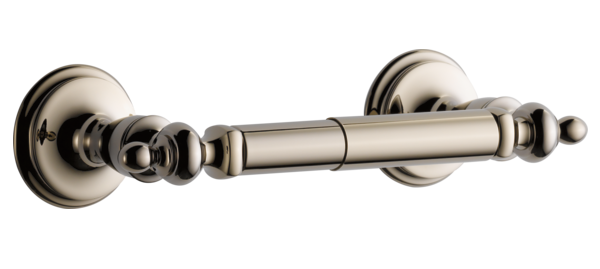
Scalamandre Zebras from DecoratorsBest | Vendome sconces from Circa Lighting | Tresa Lavatory Faucet from Brizo | Toilet tissue holder from Brizo | Silver julep cup from Enchanted Home | Beaded mirror from RH | Gramercy powder room washstand from RH | Marble basketweave tile from Julian Tile


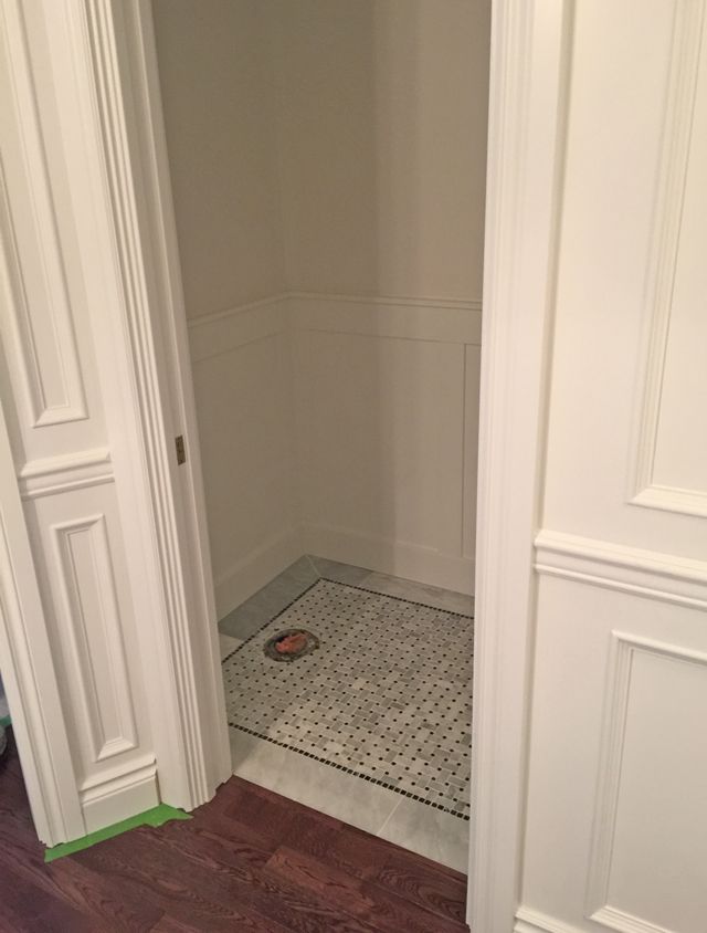
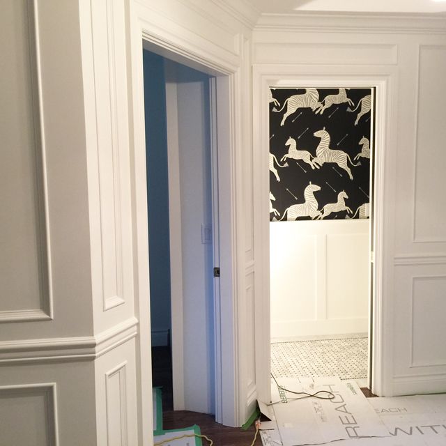
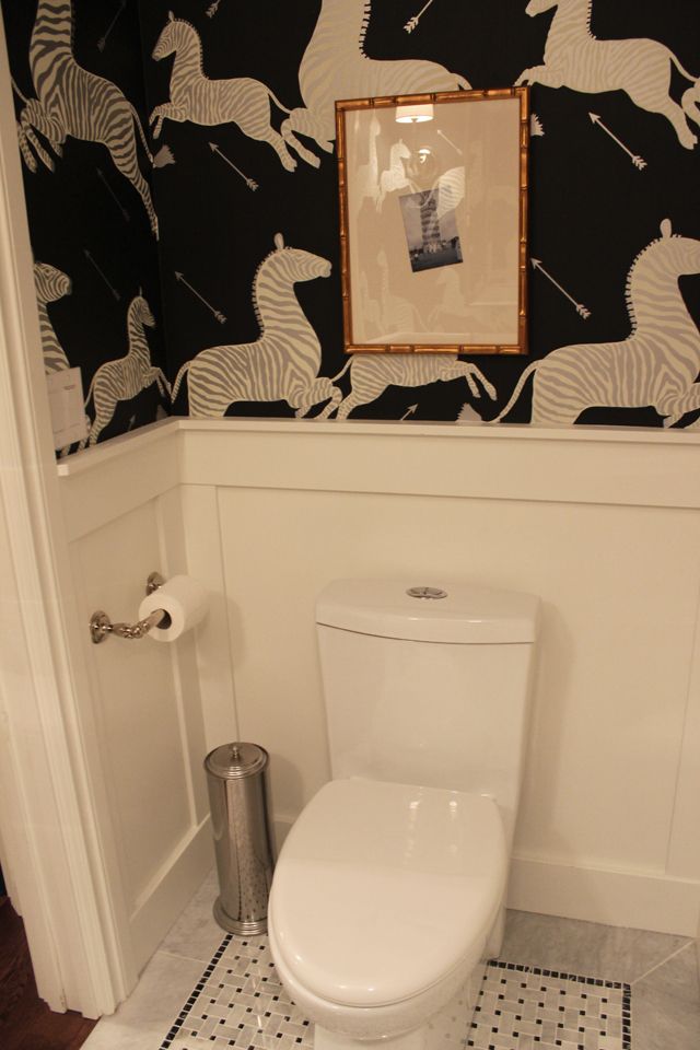
Marble tile was installed, and I love the way the oak floor meets so flush with the marble without any transition. As you can see just above and below, we installed this amazing Metrie recessed paneling in the entryway. To complement the entry millwork, we added simple board and batten with flat stock from Metrie to dress up the lower half of the wall. And let's be fully honest, I also anticipated little toddler hands could be destructive to pretty wallpaper and thought this could be and easy-to-clean and practical option:


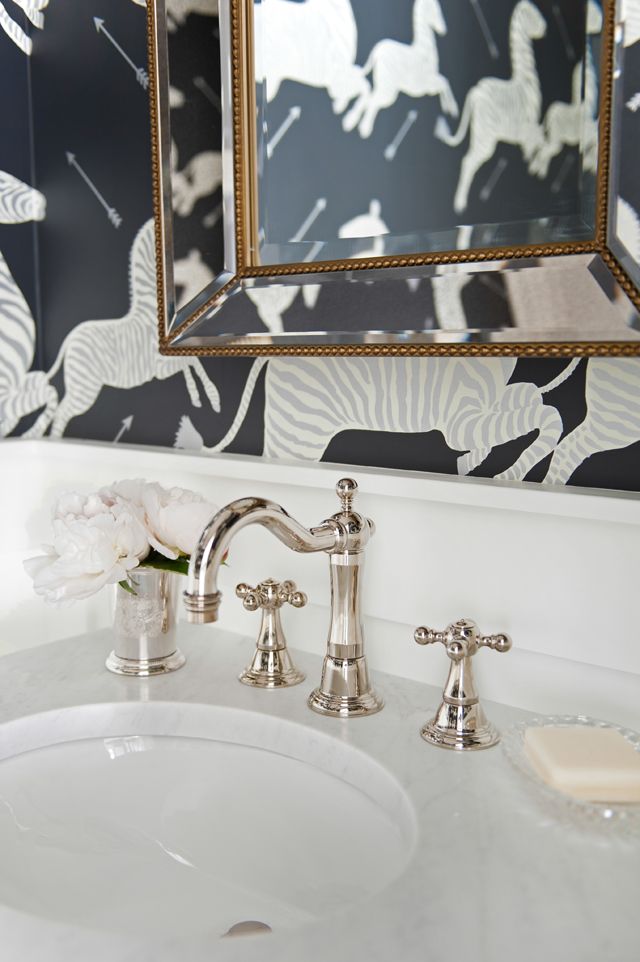
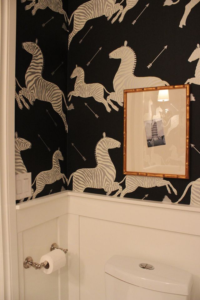
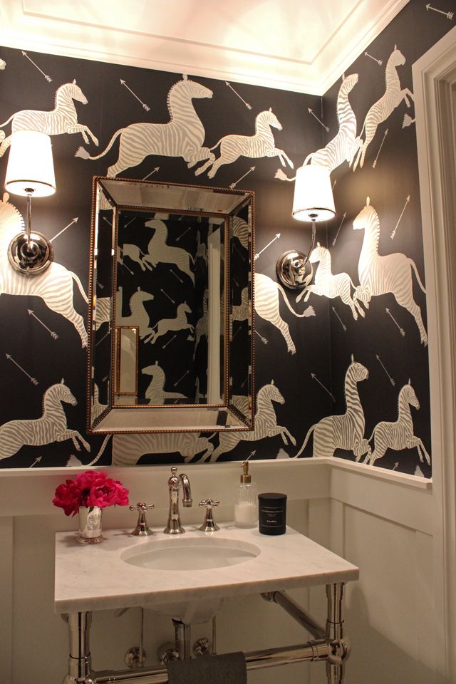
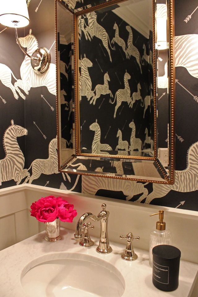
And now the completed afters; dark, moody, and pretty:


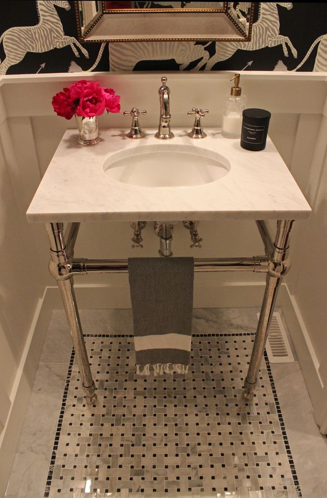
As for the washstand from RH, I found it was a lot more budget-friendly to purchase the washstand without the marble top. Pricing for having our own marble top cut and installed was much less expensive, and I could choose the piece of stone I wanted. I went with the powder room size vanity, which fit perfectly into our tiny space.


The traditional Charlotte toilet tissue holder from Brizo is so pretty, and I added conversation-starting art (a DIY) atop the toilet.


The Vendome sconces were a favorite of mine for a long time, their classic curves are perfect!


photo by Tracey Ayton Photography

Another 'fun' structural detail - the air vent was in the floor and had to be moved or I would literally have had a vent placed in front of the vanity right in the middle of the mosaic tile! (the vent has a towel stuffed into it below):


You can see that the vent is now neatly tucked into the corner:


Metrie crown molding and door casing added to the architectural details of the paneling:


In case you are curious how I hide the extra toilet paper for guests since I now lack concealed storage, I purchased an inexpensive metal tissue tower from Amazon and it does the trick:


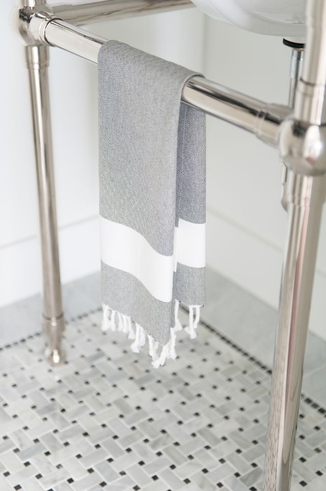
I just adore the look of a vintage-inspired cross handle faucet, and honestly the Tresa Lavatory faucet from Brizo is the prettiest faucet I have ever owned!! It comes in 4 finishes, I personally selected polished nickel to tie in with the metal of the washstand and water supply kit.


Now, I'm so thrilled that you can see a peek of this little jewel-box right when you walk into the entry of the home. It makes me happy every time I see it, and it definitely sets a first-impression with guests.


Before & after from the entry:


Thank you for taking a peek at the progress of my home! It feels like there are never-ending projects on my list but one by one they are coming to completion. We've got many rooms left so stay tuned for more reno fun in the coming months.

PINTEREST    |    INSTAGRAM    |    TWITTER    |    FACEBOOK    |    BLOGLOVIN

Tuesday, May 30, 2017

Reno Project Reveal | Living & Dining Room


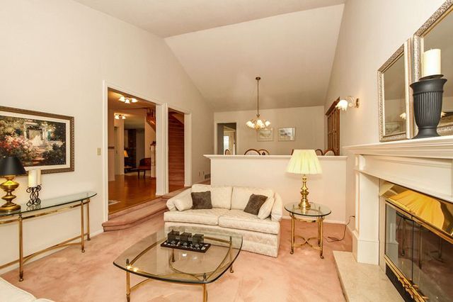
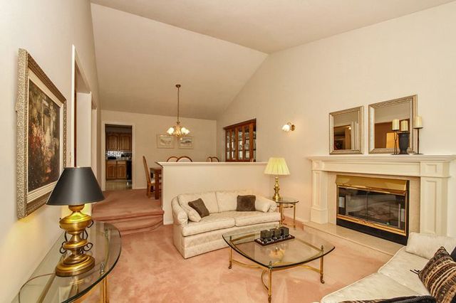
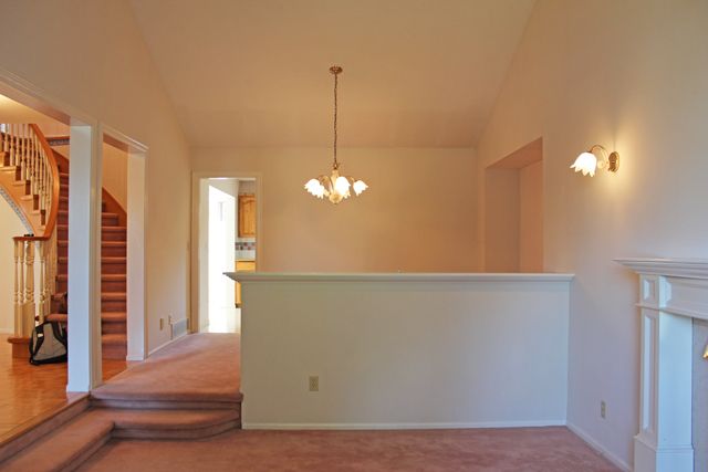
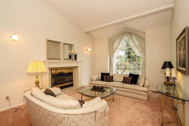
Here we go everyone! A post LOADED with before & after shots for you today (finally!). I want to start by reminding you of the beginning of the story for the living/dining space (see the original post here) - a large scale room that you see immediately to your right when entering the front door of the home. Here are the 1989 (and basically untouched since then) befores, the real estate photos we viewed when purchasing the home back in May 2015:


Notice the awkward step down in the photo below, and the pony wall separating the two spaces, the big bare-ness of the vaulted ceilings with zip-zero soul or personality. I think that was the point that bothered us the most, this was a large space, with loads of potential but it appeared so bare and boring with a complete lack of architectural detail.

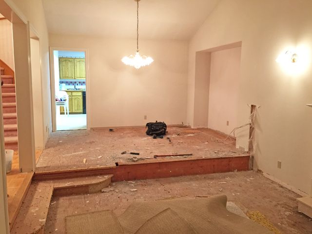
So adding architecture quickly became our main plan and priority for the room! In our last home, we saw that the efforts we put into panelling a few feature walls was a huge appeal, and a major selling feature that we strongly believe got us the most bang for our buck. So first, we quickly got rid of the pony wall to open up the space:


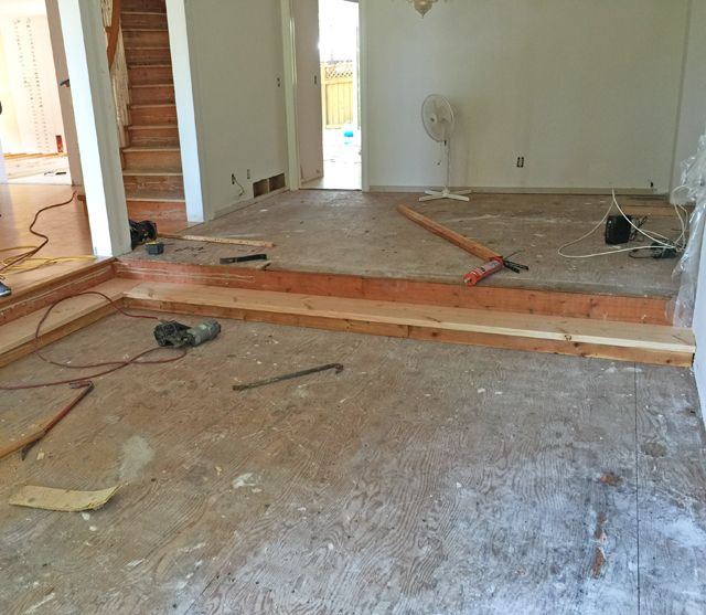
We rebuilt the step going all the way across the room:


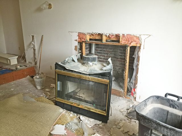
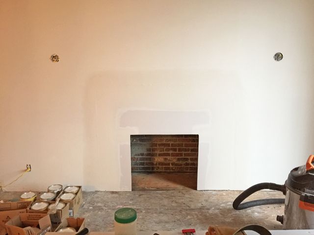
The gas fireplace insert was removed. Lucky we pulled it out as we discovered a water leak in desperate need of repair all the way up the old chimney (lots of time & money spent there sadly). We were able to conserve the old mantel with a little bit of tweaking.


Notice how far apart the sconces were on either side of the mantel? It was too widespread for my liking so I had our electrician bring them in closer on either side before we closed everything up with drywall again:


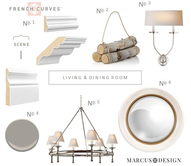
There are so many things you can do with a vaulted ceiling, and I wanted to try something a bit different. After searching for loads of inspiration photos (you can see several including an amazing space by my fav Colleen McGill in my before post), I decided to paint out the ceiling, create a tray ceiling that breaks up the wall with crown, and go heavy on the trim and moulding on the lower portion of the wall - these were just the interior finishings we needed! This was my original moodboard I created:

No. 1 - Metrie French Curves Collection Scene I, 7 1/4" Crown, Panel Mould, and 5 1/2" Baseboard | No. 2 - Crate & Barrel birch logs | No. 3 - Circa Lighting Symmetric Twist sconce | No. 4 - Benjamin Moore's Escarpment for the ceiling| No. 5 - Circa Lighting Classic Ring Chandelier | No. 6 - Lamps Plus Convex mirror

So we had the core of our plan, and we set out to execute it using the French Curves Collection from Metrie. Scene I of this collection suited exactly what I was looking for; neo-traditional style with a perfect mix of ornate and contemporary elements. It paired perfectly with the pieces we chose for our entry way which you can see from the living room and vice versa. We chose a large-scale crown (7 1/4 inch!!) to encircle the entire room and began to panel the lower half with panel moulding. So for dramatic effect, remember it without any trim:


And now that same space, voila! (All 'after' photos were taken by the talented Tracey Ayton Photography unless otherwise noted).


We added a little bit of framing detail above the fireplace similar to what you see in the photo below, I think that is the fun of planning and creating with trim and moulding, you can really let yourself get creative!

Benjamin Moore Escarpment on the ceiling, Chantilly Lace on the panelling, convex mirror from Ballard Designs

The Ikat's Meow pillow in the perfect shades of pink from Plum furniture, lacquered coffee table from Kathy Kuo Home, orchid cache pot from Jill Rosenwald

We decided to leave the fireplace non-functional but pretty for now, and with the sconces and birch logs it feels very prim and proper (antique log-holders were a Craigslist score for $30):


And then the adjacent dining room got the full treatment as well:


You can see more of my $80 Craigslist bamboo dresser makeover with FAT Paint here.

Beach Sunshine print from Artfully Walls, Jean Baptiste Geometric print from Kerrisdale Design Inc

Now I love the view toward the dining room from the living room, I just love the pink on those Ikat pillows:


Floral arrangements by Flowers & Company 

And now that the pony wall is gone, and the millwork is in, I actually don't even mind the step down between the two spaces! It sort of gets highlighted in a special way with the trim:

photo by moi


Thank you so much for taking this crazy reno ride with me! More to come soon, but in the meantime you can hop to my mouldings how-to post, my entry way reveal, main bathroom, and my kitchen reveal in case you missed them. Please leave any questions you have below and I will do my best to answer them :)

PINTEREST    |    INSTAGRAM    |    TWITTER    |    FACEBOOK    |    BLOGLOVIN
Related Posts with Thumbnails
 

© 2010-2017 Nancy Marcus. All Rights Reserved. | Blog Design By Brittany Douglas