Wednesday, September 28, 2016

Trendspotting | Interior Design Show Vancouver 2016


This past week was design week in my city, and I always enjoy being able to attend IDSvancouver and hone in on what's to come next in the design and décor world. I saw several common threads in the exhibits this year, and I'm happy to give you a peek into some of the upcoming trends, as well as those continuing from recent years. Above you can see a snapshot of my favorite installation of the week, a stunning Dinner by Design tablescape created by Stephanie Brown. I just was captivated by the oversized trio of pendants from Once A Tree Furniture, and the mixture of textured moss, warm brass and cool stone.


I included the shot above from Stephanie's IG account, as it shows off the Kelly Wearstler Halcyon round sconce with natural quartz stone. The brass in the stools, lighting, and flatware perfectly compliments the sconce quartz and marble place settings. Wouldn't you love to attend a dinner party here?


I quickly came to realize that living walls, preserved moss, and plant installations were utilized in at least half a dozen of the exhibits. Take note, natural green is in!


What does this mean for those of us that don't have the room for a giant living plant wall in our home? Well, I took from it that the textures are incredible - I now know I NEED a set of preserved moss rocks to display in my entry way vignette! Translating big ideas like this into workable ones for your own home is just like taking the artistic fashions off the runway and tweaking their design into something that will work for daily living.

Another example of brass & marble in a heavenly combo - the Arteriors lamp below as displayed by Ocean Pacific Lighting:


Loved everything about their display! You can never go wrong using classic fixtures, and finishes like this convex mirror:


Brass vintage-style bath fixtures are still going strong, I don't think you have to shy away from this finish any time soon:


And matte black kitchen and bath fixtures are the newer player in the game, we've seen them begin to crop up in the past couple of years:


I loved the gold decals at Urban Walls! Just imagine these palm leaves on a black wall in a powder room - yum! And the pink oversized florals were so eye catching:


Speaking of pink and florals, this was another very refreshing Dinner by Design installation, the hanging sculpture casted the most amazing shadows on the space:


Patricia Gray's artwork was incredible, it's really hard to capture on camera but if you can just imagine these pieces utilize silver leaf and a shiny resin coat, they glittered!


image via Patricia Gray

Oversized abstract art is an amazing addition to any home, here is another piece by Heather Ross, whose open studio also celebrated the release of her book, The Natural Eclectic. She shared with me that she already has plans to transform the massive hand painted drop-cloths from her space into tote bags!


And finally, Once A Tree never disappoints. It was all classic here, and I couldn't get enough of those herringbone floors. Their furnishings are solid pieces you know will never go out of style, and when we are making investments in our furniture pieces, I think 'trendy' definitely isn't the way to go!

image via Catharine Grasty

I'm listing moss, marble, and brass mixed with classic furnishings and original art as my favorite finds in this year's show. That's what I'd personally love to fill my home with. Oh, and throw in those herringbone floors while we're at it! Foliage is in this year, perhaps we can say green is the new black! Any recent trends you have been noticing at trade shows in your area?

PINTEREST    |    INSTAGRAM    |    TWITTER    |    FACEBOOK    |    BLOGLOVIN

Thursday, September 8, 2016

Reno Project Update | The Main Bathroom Befores


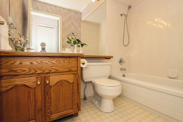
We've got so many rooms ALMOST complete in our house - it seems there is a few things left to do in nearly every space, but the good news is we are getting there!! I want to try to diligently post an update weekly to give myself a little extra nudge to get things done :) So here is my update for this week, the main (kid) bathroom. You know where we always have to begin - the ugly befores!! Here's a wide-angle realtor shot of this 1989 gem:


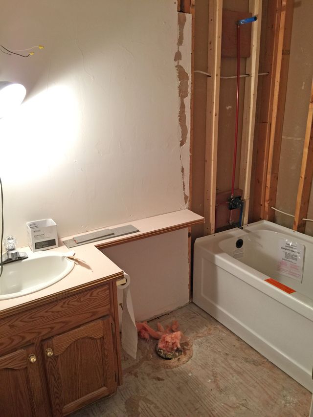
So once again we are dealing with linoleum, honey oak cabinetry, pink wallpaper, and a few flowery tiles bordering the top of the shower. There was no choice but to start from (almost) scratch:


Phew, that's a relief!


We actually got rid of the toilet and replaced the tub in the above photo as well. Really the only thing to stay was the box of the cabinet; to keep things budget-friendly we opted to replace only the doors with new ones and paint the unit out. We also wanted to maximize the feeling of space in this tiny bathroom so we removed the drywall ceiling drop within the shower (in other words, now the new shower tile can go all the way to the ceiling in there!)

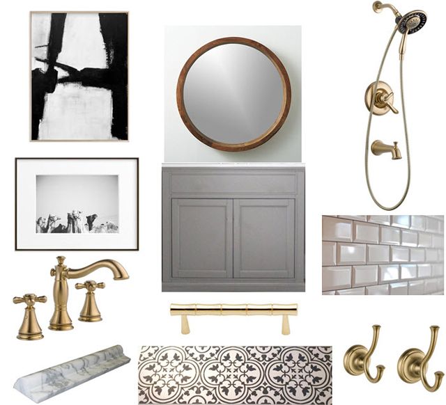
So here is a peek at the mood board to give you an idea of where we are going with the design:


Minted artwork (Gentle Embrace and Leader of the pack) | CB2 Acacia round mirror | Delta Faucet Linden Monitor 17 series shower | Delta Faucet Cassidy widespread lavatory | Creekside beveled subway tile and Carrara marble chair rail | Rejuvenation Kanota drawer pull | C&S Tile Hydraulic tile | Delta faucet Cassidy robe hooks

I love the champagne bronze finish of the Delta Faucet the fixtures, it adds such warmth! I also feel like this is a "kid" bathroom that a child can truly grow with. Oh, and of course I had to add that pack of camels for a little dose of fun. We've taken the subway tile and chair rail all the way around the room at a 42" height, here's hoping it's easy to clean (...says the new mom who fears the potty-training stage)! And I'll leave you a teaser of the progress, the finished space to follow soon ...


PINTEREST    |    INSTAGRAM    |    TWITTER    |    FACEBOOK    |    BLOGLOVIN

Monday, May 23, 2016

One Room Challenge | Nursery Reveal | Spring 2016


Well my dear friends, it's a week and a half late, but I'm going with the 'better late than never,' perspective! The nursery for my ORC is finally complete!! Maybe a bit ambitious to commit to 2 spaces while caring for a newborn, but I still say that taking on the One Room Challenge was the only reason I got these two spaces done at all ;) (see the breakfast nook ORC reveal here).

Before I take you through the whole tour of the nursery, I want to take you WAY back, to what this space actually looked like when we purchased the home:


And by the look of the original bunny rabbits & pink bow wallpaper that we had to painstakingly remove bit-by-bit, it probably was a nursery in it's former 1989 life too!!


We smoothed over the awful textured ceiling, and removed the dinky chair rail and baseboard and swaped them out for some fantastic baseboards and door casings from Metrie's French Curves Collection, new beefy crown, and we got a little creative and utilized this chair rail for the window sill (where there was none before!). Just because you are working with a small room doesn't mean you have to use tiny trim, in fact I think these substantial pieces really helped to show off the angles of the space.


And this was officially my starting point for the 6 week challenge, Metrie trim installed, window was swapped out for a new modern shape, the Cole & Son Nuvolette wallpaper from DecoratorsBest was in place, and the lovely little brass chandelier from Shades of Light was installed.

So now without further adieu, some side by side before and afters, I'll let the photos do the rest of the talking!


The day bed with it's brass hardware and Hudson's Bay throw was very Nam Dang Mitchell inspired, I just love her style!


I love love love all the artwork from anewall, and I jazzed up the Ikea RIBBA frames below with a quick and easy touch of gold paint.


Because this was a more 'personal space' we tried to be mindful of adding personal touches all around the room; things like the pharaoh below, a nod to Marcus' Egyptian side, and a pillow with French script for his French side. We added my hubby's favorite car as well as art to represent his love of flying model airplanes, a children's book about my favorite scientist Louis Pasteur, and even a teddy bear in a lab coat and glasses to remind Marcus of his mama's Biochemistry background!


Source List:  French Curves Collection (Scene I) door casing, and baseboards, crown, and chair rail c/o Metrie | Garnished Medallion rug c/o Rugs USA | Cole & Son Nuvolette via DecoratorsBest | Artwork c/o anewall (except the DIY horse canvas) | Buffalo check and Paris pillows by Old Lake George | Chandelier via Shades of Light | Roadster and crib throw blanket via Indigo | Point Blanket via Hudson's Bay | Daybed and shelving via IKEA | Daybed hardware via Lee Valley | Crib via Shermag | Dresser via Craigslist |

Oh yah, and one more really important thing to show you, the inhabitant of this room! Who surely is going to throw everything for a loop in here once he gets mobile, but for now mom can enjoy all the pretty :)


You can view my full moodboards, and all the previous weeks of planning and prepping in weeks 1 | 2 | 3 | 4 | and 5. Thank you to all of you who visited week by week, a huge hug for taking this crazy journey with me and I hope you enjoyed the results as much as I am loving them!
 
PINTEREST    |    INSTAGRAM    |    TWITTER    |    FACEBOOK    |    BLOGLOVIN

Sunday, May 15, 2016

One Room Challenge | Nursery Update | Spring 2016


Happy Sunday everyone! Just checking in quickly to say I haven't forgotten to post my now WAY overdue ORC nursery - we've been delayed but we are almost there! The artwork is (mostly) hung & awaiting only the rug! My one DIY for this space was the horse watercolor with an Hermes inspired orange canvas wrap, which pairs perfectly with the gorgeous print from anewall.

Oh, and I should make mention that the cute little inhabitant of this room had a little something to do with its taking so long as well. I'm learning to expect everything takes approximately 3-5 times as long as my head thinks it should! Full reveal in the next few days :)
 
PINTEREST    |    INSTAGRAM    |    TWITTER    |    FACEBOOK    |    BLOGLOVIN

Thursday, May 12, 2016

One Room Challenge Week 6 | Breakfast Nook Reveal | Spring 2016


We did it! We made it through the 6 weeks, and sure there were a few hiccups here and there but overall I got more completed in these 2 spaces than I EVER would have done if I had not taken on this challenge. By far. Before I take you through the reveal I wanted to quickly take you WAY back, to what this space looked like when we moved in a few months back:


The biggest change to this room, which took place before our 6 week count-down, was to remove the railing between the adjoining room, get rid of the step down and level the entire space with new flooring.


There's no way we could have done those initial reno's in the 6 week time-line, but I thought you would enjoy seeing how far a room has come from it's original 1989 state! Ok, so with a few side-by-sides for dramatic effect, here are the before and after shots (drumroll please!!):


Something that was super important to us was getting the foundation right - everything builds off of here! So adding substantial baseboards and doorcasings with Metrie's French Curves Collection, plus some crown moldings, and the shaker style door by Masonite (brought to you by Metrie), and a lick of Chantilly Lace (Benjamin Moore) was just what this space needed to start with a clean palette.


Love that this space connects with the outdoor space on the patio so well, so I decided to take the blue & white theme right outside!


Source List: Door casings and baseboards from the French Curves Collection (Scene I) and crown moulding  c/o Metrie | Pantry door from Masonite - brought to you by Metrie | Rustic pedestal table and blue & white garden stools c/o O.co | Vanderbilt pillows by MotifPillows | Rattan chairs via Craigslist | Darlana lantern via Circa Lighting | Blue & white tableware via Bombay & Co | Placemats via IKEA
 
There were definitely a fair share of hiccups; we didn't quite get the artwork in time and had a couple of issues with framing, so I had to use one of my own pieces as the oversized piece for the reveal. The one DIY that we didn't quite get completed in time for the reveal was the placement of the Self-adhesive glass frost panels (c/o d-c-fix) that I am going to be showing you how to apply in a dedicated post (coming soon!).
 
You can see my full moodboard and step by step planning in weeks 1 | 2 | 3 | 4 | and 5. Thank you so much for following my ORC spaces, huge hug for taking this journey with me :) Don't forget to hop over to Calling It Home blog to view 200+ guest participant rooms and the stellar spaces completed by the 20 featured designers!

Be sure to check back shortly for the final reveal on my nursery, I'm literally sitting by the front door waiting for the artwork to arrive so I can post my second space. I just couldn't fathom posting without it in the room so I'm hoping I'll be getting a knock on the door any moment!!
 

PINTEREST    |    INSTAGRAM    |    TWITTER    |    FACEBOOK    |    BLOGLOVIN
Related Posts with Thumbnails
 

© 2010-2017 Nancy Marcus. All Rights Reserved. | Blog Design By Brittany Douglas